
HFMA
Branding the voice of UK natural health
Branding
Graphic Design
Web Design
Web Development
We worked with our long time client Health Food Manufacturer’s Association to help refresh their brand identity. Stimulated by dynamic shifts to modernise the association’s modus operandi, they approached Think Creative to create a fresh, sleek and modern identity to represent this exciting new ‘digital first’ change with their organisation.
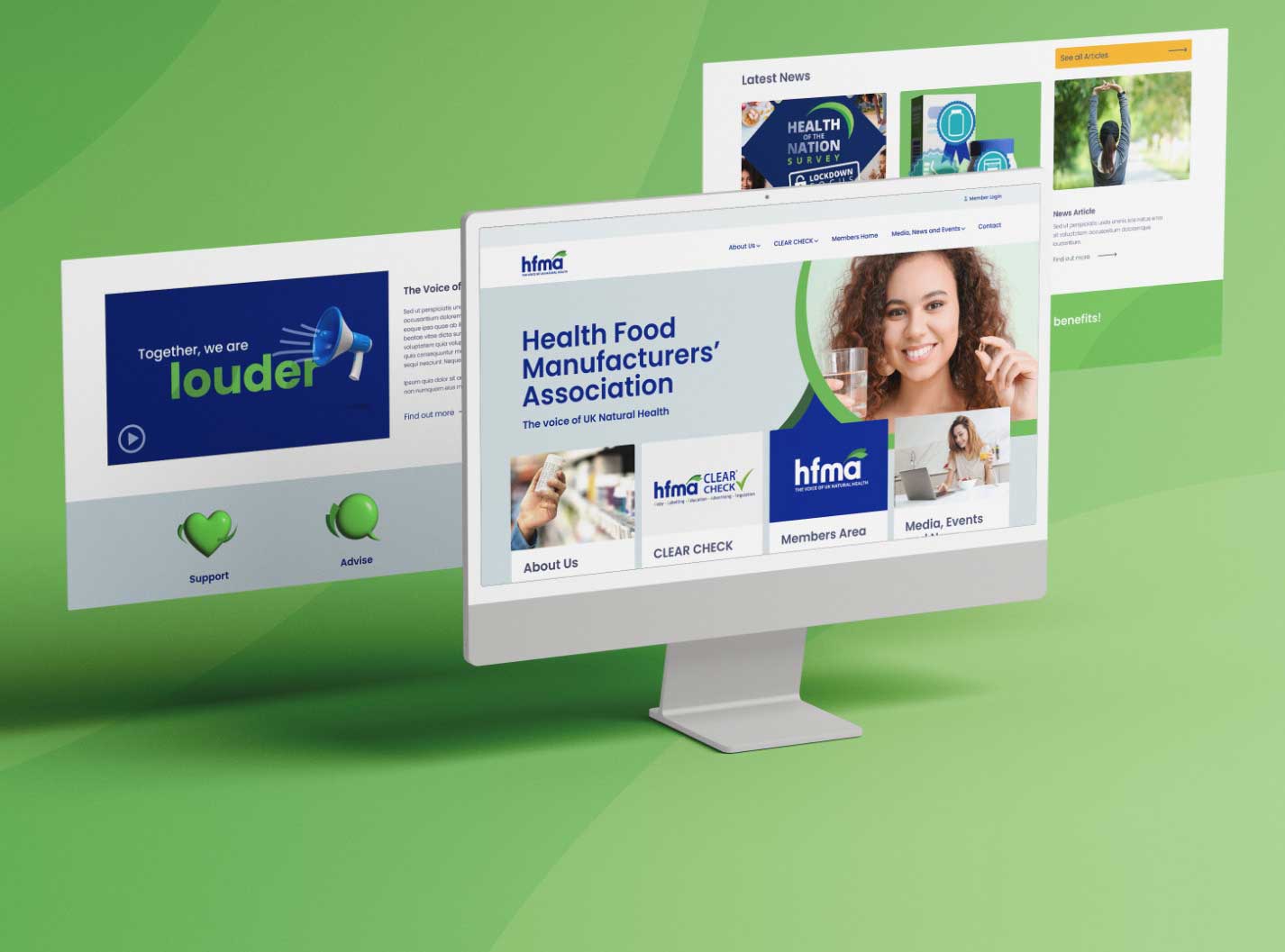
Our core focus with the brand refresh was to enhance the identities look and feel to further reflect the positivity and the health values that HFMA holds. Inspired by vivid tones created in nature we increased the vibrancy of the brand’s existing colour palette and supplemented that with an additional suite of bold, contrasting secondary colours. We created the new ‘swoosh’ graphic device to allow flexibility and visual consistency across different formats. The imagery was kept light and positive, focusing on lifestyle more than specific products. Their three core values we created bespoke icons for are ‘Support’ ‘Advise’ and ‘Protect’.
We then created a brand new website as the new flagship of their new ‘digital first’ mentality. We improved the user journey through strategically organising their most important information to the homepage, and condensing down content and reducing the number of pages to create a more streamlined experience. We wanted to make a website that reflects HFMA’s approachability and positivity, so we kept things simple and clear with light colours and imagery. We then took this styling and approach to flow into their print materials for a consistent look and feel both internally and externally. This suite included a full stationery set, business cards and an extensive annual report.
We then created a brand new website as the new flagship of their new ‘digital first’ mentality. We improved the user journey through strategically organising their most important information to the homepage, and condensing down content and reducing the number of pages to create a more streamlined experience. We wanted to make a website that reflects HFMA’s approachability and positivity, so we kept things simple and clear with light colours and imagery. We then took this styling and approach to flow into their print materials for a consistent look and feel both internally and externally. This suite included a full stationery set, business cards and an extensive annual report.