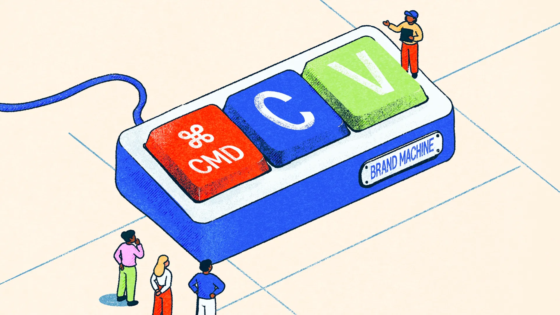
Brand guidelines and design systems are often talked about as though they're interchangeable, or that one is simply a more complicated version of the other. They're closely related, but I think there's an important distinction between what they're trying to achieve. Brand guidelines are there to establish what makes an identity recognisable, explain the thinking behind it and help people understand how to apply it. A design system takes that thinking a step further, translating it into a practical collection of tools, rules and reusable components that help people actually build things.
Neither needs to be particularly complicated, and not every organisation needs both to the same degree. We've worked with businesses where a relatively straightforward set of brand guidelines is more than enough, and others where an extensive design system becomes an essential part of how their website, products and wider communications operate. The interesting bit is understanding where one ends, where the other begins and how they work together to make life easier.
Brand Guidelines Establish The Thinking
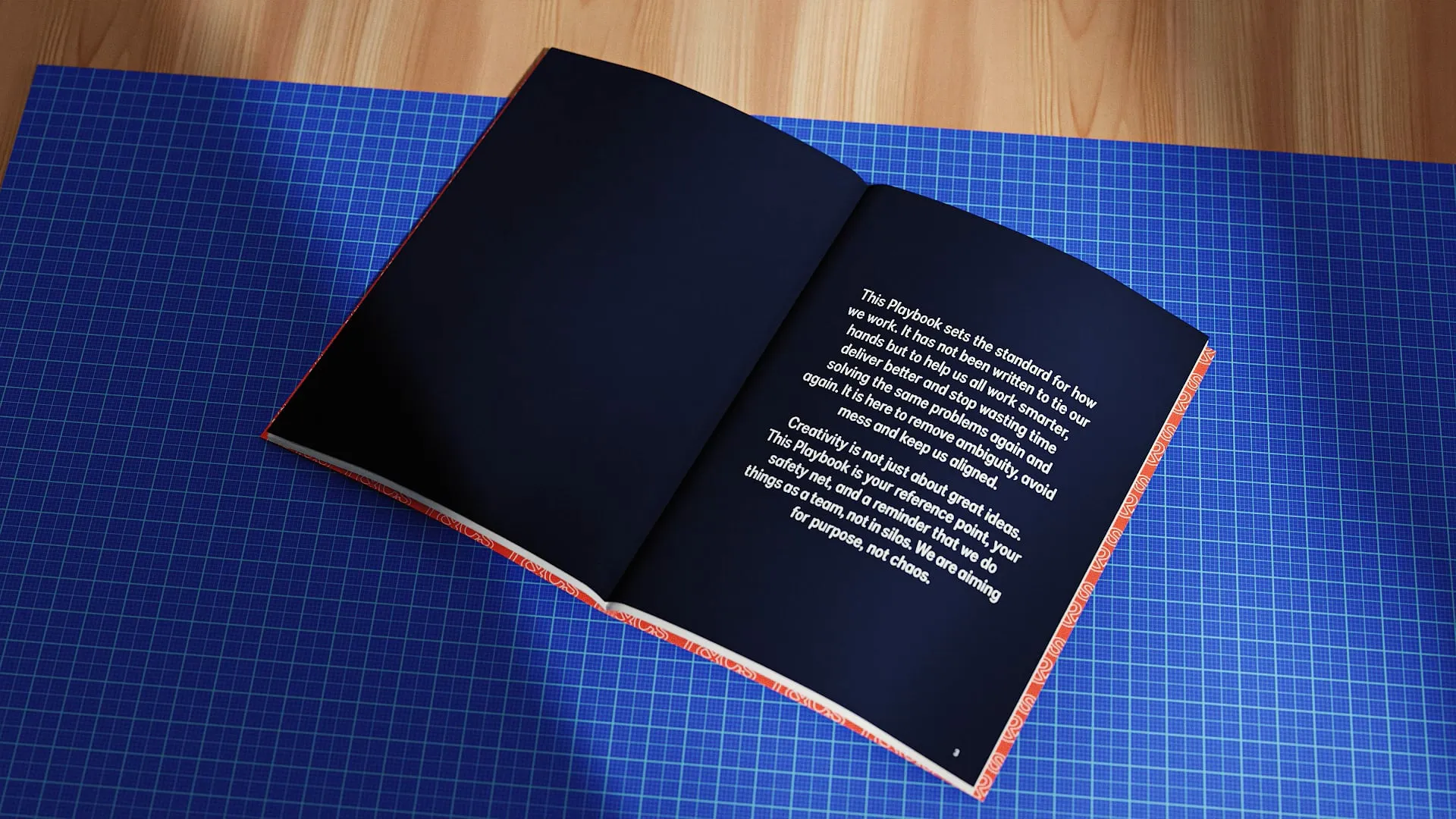
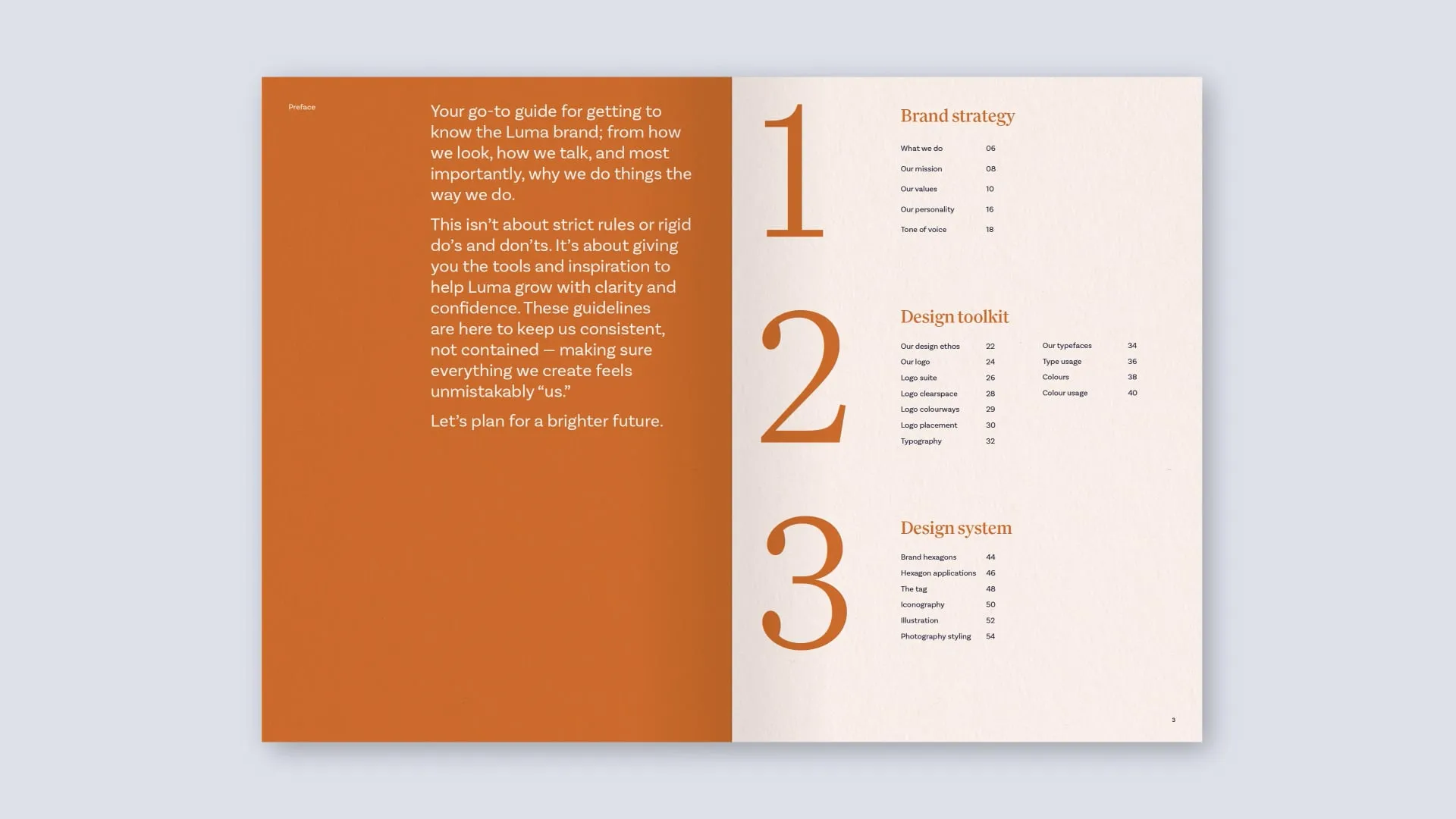
I've always believed that good brand guidelines should explain considerably more than where to put a logo or which colours belong together. At their best, they're a concise expression of the brand itself. What does the organisation stand for? What makes it different? How should it communicate? What should people feel when they encounter it? The visual identity is an expression of those things, and the guidelines should help people understand the reasoning behind the decisions rather than simply presenting a collection of rules to follow.
That understanding is important because the reality of branding is that you'll never anticipate every possible application. A brand might need to work on a website, a vehicle, a presentation, a tiny social graphic or an enormous exhibition stand. Trying to document every conceivable variation would be practically impossible, and probably wouldn't make particularly enjoyable reading either. What you can do is establish enough of the thinking that somebody understands how to interpret the identity intelligently, making informed decisions without losing the character of the brand.
Apple is quite an interesting way of thinking about this. The company's broader identity and principles have a recognisable character, but that doesn't mean the technical specifications and interface decisions behind every iPhone need to be written into a corporate brand book. Those belong to a different level of documentation, one concerned with how the products are designed and implemented. Apple's publicly available Human Interface Guidelines demonstrate that distinction rather nicely, covering everything from fundamental design principles through to interface components, interaction patterns and platform-specific behaviour.
The underlying ideas provide continuity, while the technical implementation can evolve with new products, technologies and requirements. I think that's a useful distinction for almost any organisation. Your brand guidelines should help explain what needs to remain recognisable, while leaving room for the practical systems that support it to develop over time.

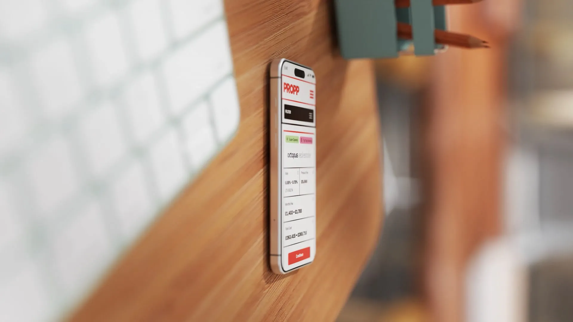
Design Systems Turn Principles Into Building Blocks
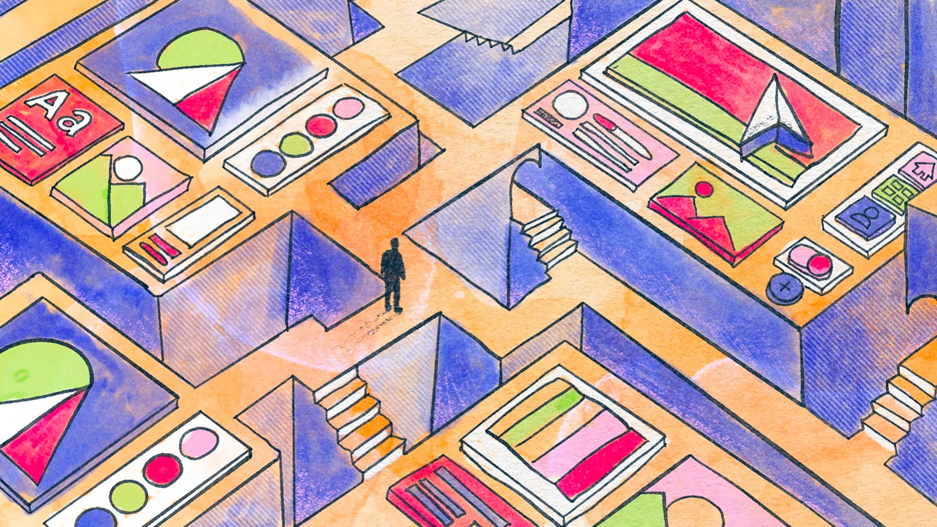
A design system is much closer to the technical side of making things. It's where the broader principles of an identity become tangible, reusable decisions about typography, spacing, colours, layouts, components, interactions and behaviours. Rather than deciding how something should look every time you create it, you establish a set of rules and building blocks that can be used repeatedly, adapted and improved as the organisation grows.
At Think, we use this thinking across much more than websites. Our own design system uses structured grids, proportional relationships, measured spacing and carefully considered typography scales. We use Fibonacci-inspired jumps to create impact through larger type, alongside more controlled increments for everyday information. Those principles can then inform anything from a digital presentation to a printed proposal, signage or the layout of a website. The applications might look very different, but there's a consistent underlying logic connecting them.
I often think of design systems a little like Lego. You have a collection of individual pieces, each designed to work with the others through a shared set of connections and rules. Those pieces might be incredibly simple, but the number of things you can create by combining them is enormous. The important part isn't that every creation looks the same. It's that the components are compatible, the rules are understood and you have enough flexibility to build what you actually need.
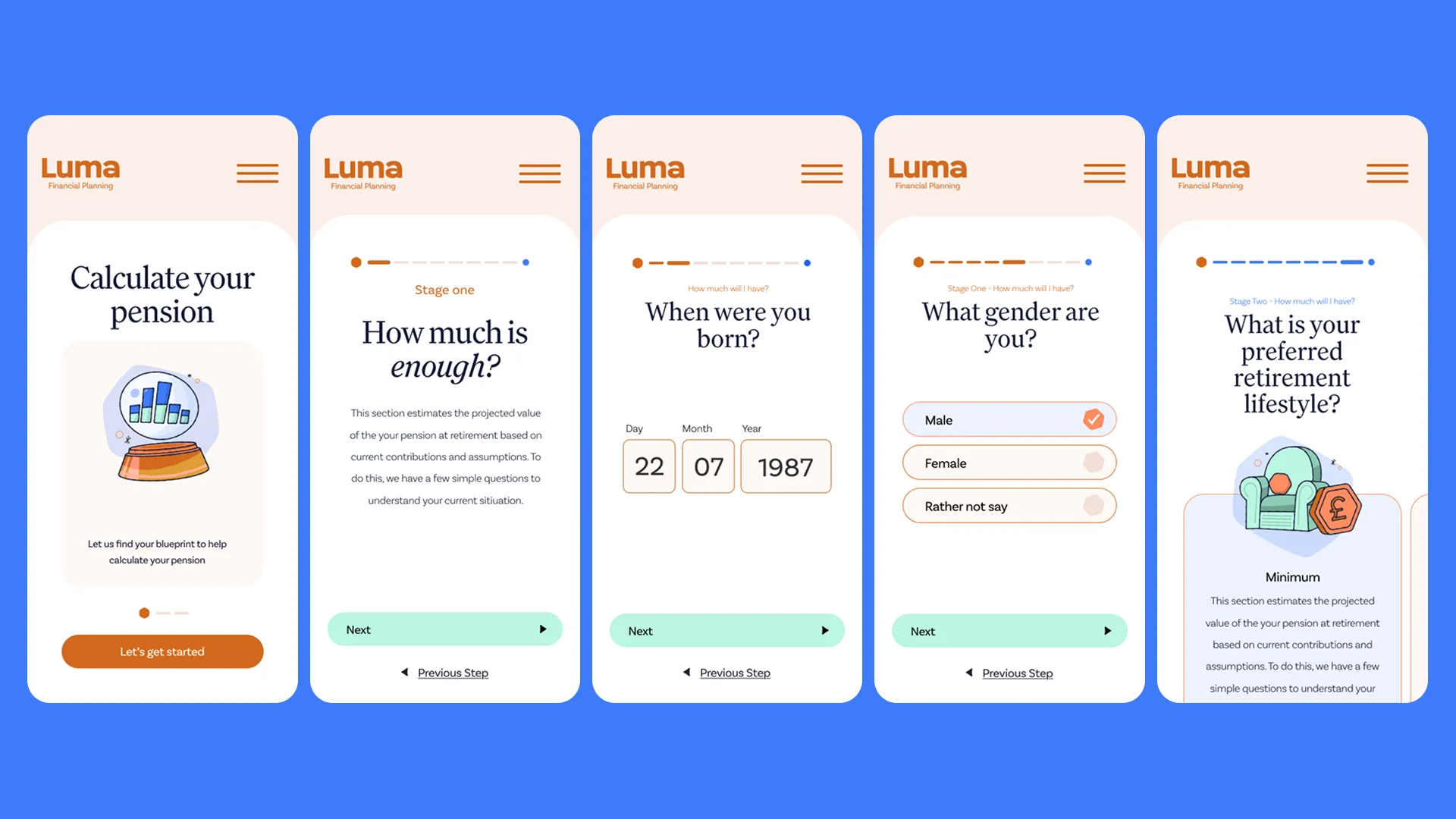
Digital design systems work in much the same way. You might start with small decisions about colour, spacing, border radius and typography, often managed through design tokens or variables. From there, you create buttons, cards, navigation elements, forms and other components, which can then be combined into larger sections, templates and entire interfaces. Each layer builds upon the previous one, helping maintain consistency without requiring everything to be designed from scratch.
And they can become enormous. Google's Material Design is a good example of a system that has to account for different components, states, interactions, layouts and applications, with an extensive collection of technical guidance and reusable interface elements. But that's appropriate to the scale of the products it's supporting. Most businesses aren't Google, and they certainly don't need to build something of that complexity simply to maintain a consistent identity.
The right design system isn't necessarily the biggest or most technically sophisticated one. It's the one that gives an organisation the tools it actually needs, without creating unnecessary complexity in the process.
Why We Design Websites Component First
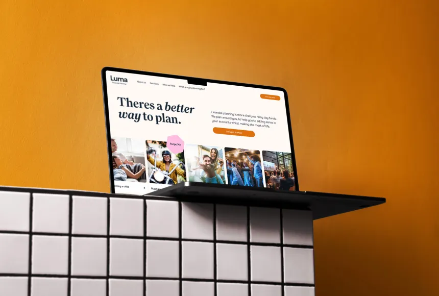
This is where design systems become particularly valuable in our day-to-day work at Think. We've increasingly adopted a component-first approach to web design and development because it gives both our designers and our clients much greater flexibility. Rather than designing every page as a fixed template, we create a collection of carefully considered components that can be assembled into different layouts depending on the content and what the page needs to achieve.
Imagine you've got a website with twenty pages, all designed individually. At some point, you decide that the way you display testimonials needs to change, or a particular content section needs additional functionality. Without a properly considered system, that might mean revisiting several layouts, making adjustments in different places and potentially introducing inconsistencies along the way. With reusable components, the change can be made to the underlying element and applied consistently wherever it's used.
There's also a considerable benefit for the people managing the website. Marketing teams shouldn't need to become designers every time they create a page, and they shouldn't have to worry about accidentally breaking the visual identity when they update content. By building the design decisions into the components themselves, we can give editors the flexibility to create different layouts while maintaining control over how the site looks and behaves.
We use this thinking whether we're building a straightforward WordPress website or something more complex with Laravel and Statamic. The scale of the system changes, but the underlying principle remains the same. Rather than giving clients a handful of rigid page templates and hoping their content always fits, we want to provide a flexible set of tools that can accommodate the things they'll need to do in the future.
That investment becomes particularly valuable as projects grow. An organisation might initially need a marketing website, but later introduce an e-commerce store, comparison engine, membership platform or a dashboard for its customers. Having an established component library and a coherent set of design rules means that new functionality doesn't have to introduce an entirely different visual language. Designers and developers can build upon what's already there, concentrating more of their attention on solving the new functionality rather than continually rebuilding the foundations.
A design system won't remove the need to design something new, and it certainly won't eliminate the complexity of developing additional features. What it does provide is a much stronger starting point, helping new parts of the product feel like they belong while reducing the amount of repetitive work required to get there.
How Much System Do You Actually Need?
I think this is probably the most important question, because there's very little point in building a hugely complicated design system for an organisation that simply doesn't need one. A business starting out with a relatively small marketing website might only require sensible typography, a consistent colour palette, reusable banners, content sections and a few carefully considered page layouts. That could be more than enough to give its website flexibility and maintain a professional identity.
A larger organisation might have several internal teams, multiple agencies, a complex website and products that are constantly evolving. Suddenly the system needs to accommodate significantly more people, more applications and more opportunities for things to drift apart. The more people involved in creating and maintaining the brand, the more useful it becomes to establish shared components and clearly documented rules. Otherwise, every new project risks becoming another interpretation of something that should already have been considered.
We've approached this challenge from both ends at Think. For organisations that need something straightforward, we've developed Upply, our flexible WordPress Elementor framework through Upkeep. It gives us an established collection of professionally designed components and layouts that can be adapted to suit an individual business, without requiring the time and investment involved in designing an entire system from scratch. It's a practical way of giving smaller websites some of the advantages of component-based design, including flexibility, consistency and a much easier editing experience.
At the other end, we create bespoke design systems for organisations with more substantial digital requirements. These can support larger websites, applications and platforms built using technologies such as Laravel and Statamic, where the structure needs to accommodate more complicated content, functionality and long-term development. The principles are similar, but the level of investment reflects what the organisation actually needs to achieve.
And that's really the point. You don't necessarily need a sophisticated design system to have a strong brand, just as you don't need a vast brand book to create something recognisable. You need a clear understanding of the identity, the people who will be using it and the practical demands being placed upon it.
Brand guidelines establish the thinking, while design systems help translate that thinking into something repeatable, flexible and useful. They should support one another, evolve as the organisation develops and ultimately make it easier for people to create good work without needing the original designer looking over their shoulder.
Whether you're starting with a simple WordPress website, looking to bring more consistency to an established brand or planning a much larger digital platform, it's worth getting those foundations right. At Think, we work across that entire spectrum, from accessible, component-based websites through to bespoke brand identities and complex digital design systems. If you're unsure what your organisation actually needs, we're always happy to help you work it out before you commit to building something unnecessarily complicated.
Because the real value of a design system isn't how many components it contains. It's how much easier it makes creating whatever comes next.