Propp
A Propper digital step forward
At Think, we’ve spent more than 25 years developing brands, designing websites and helping organisations move forward. Along the way, we’ve built a considerable amount of experience in the everyday work that keeps websites running. WordPress development, hosting, maintenance, fixes and the small improvements that make a big difference.
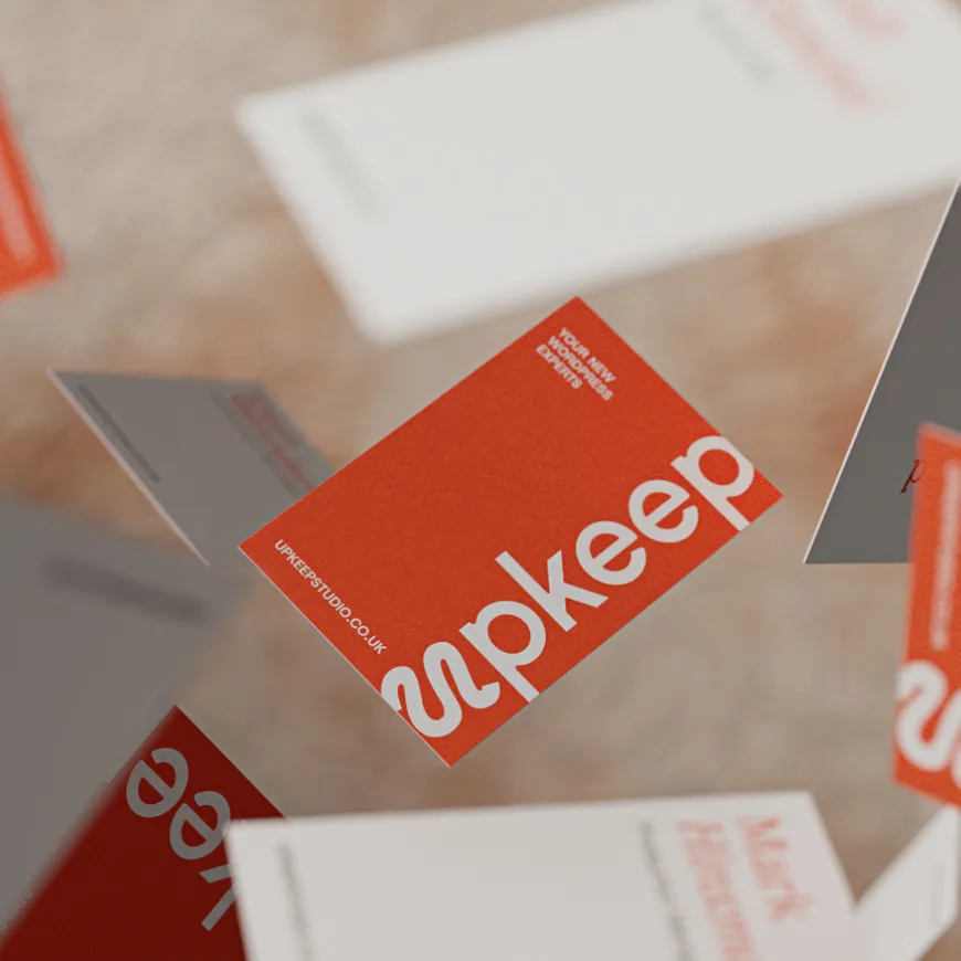
Upkeep gives that expertise a home of its own. We created the brand strategy, visual identity, bespoke typography, illustration system and website for a dedicated WordPress service powered by our team. A straightforward offer with a distinctive personality, and a brand we’re proud to have sitting alongside Think Creative.
Our starting point was a familiar situation. A business has a website, something needs attention, and nobody is quite sure who to ask. Perhaps the original developer has disappeared. Perhaps the site has become slow, awkward to update or increasingly unreliable. Sometimes, the business simply needs a new website and an experienced team to build it properly.
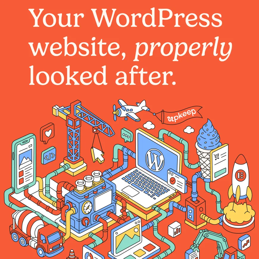
We approached the project by defining the relationship between the two brands. Think continues to bring together brand strategy, design and ambitious digital development. Upkeep gives WordPress support, maintenance, hosting and website design a more focused route to market. The connection provides reassurance, while a separate identity gives Upkeep the freedom to speak directly to its own audience. That thinking shaped the central promise: your WordPress website, properly looked after.

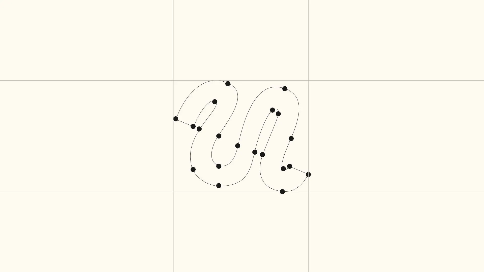
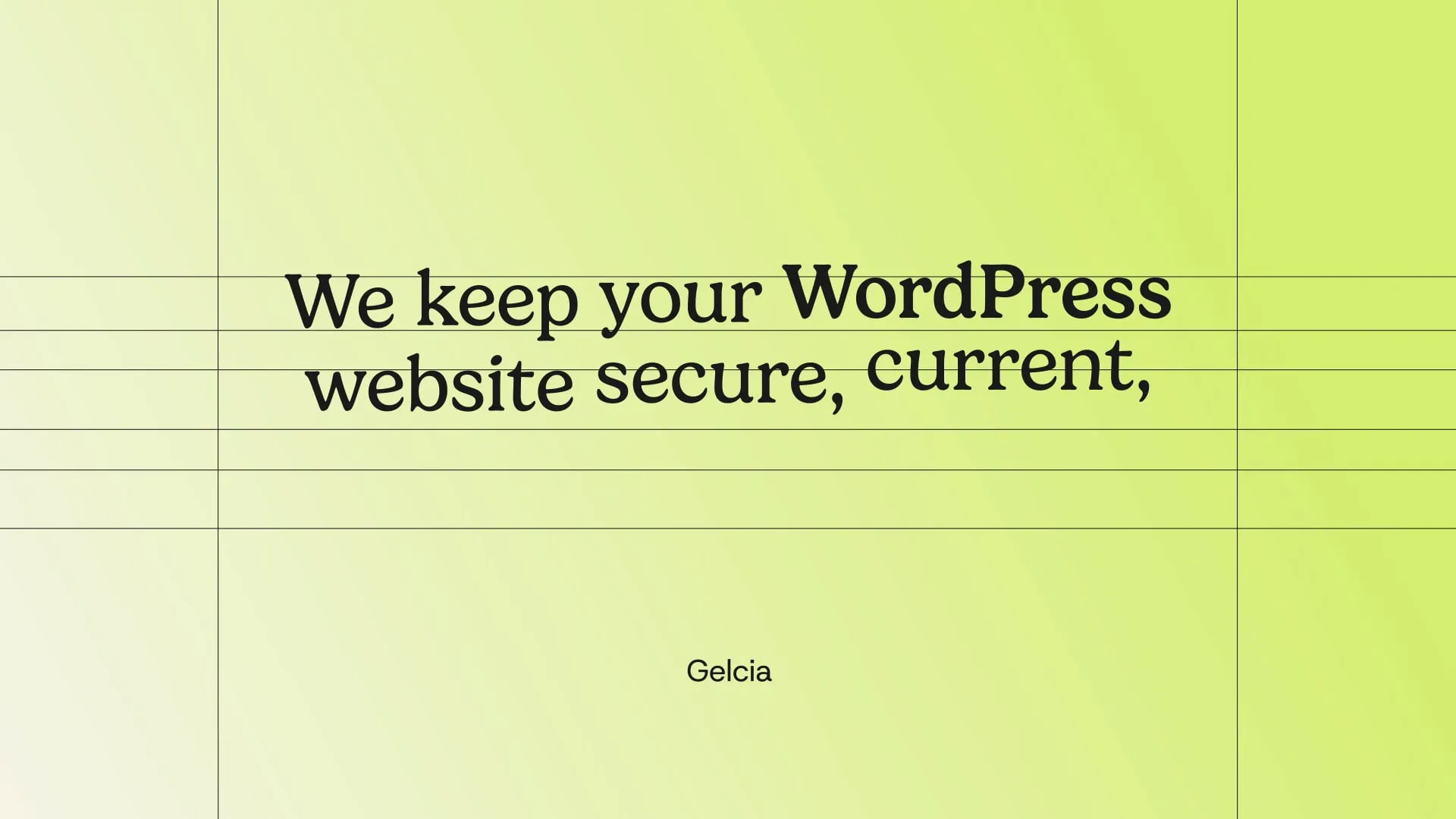
Typography gave us another opportunity to make the identity distinctly Upkeep. We developed Upkeep Sans, a custom typeface that extends the brand into the everyday details of its communication. Paired with expressive serif headlines and italic emphasis, it creates a balance between practical clarity and a more conversational, editorial character.
The wider design system establishes consistent relationships between type, spacing, colour, imagery and layout. Service cards, pricing panels, buttons and content modules share a clear visual structure, allowing the website to accommodate detailed information while retaining a recognisable rhythm.
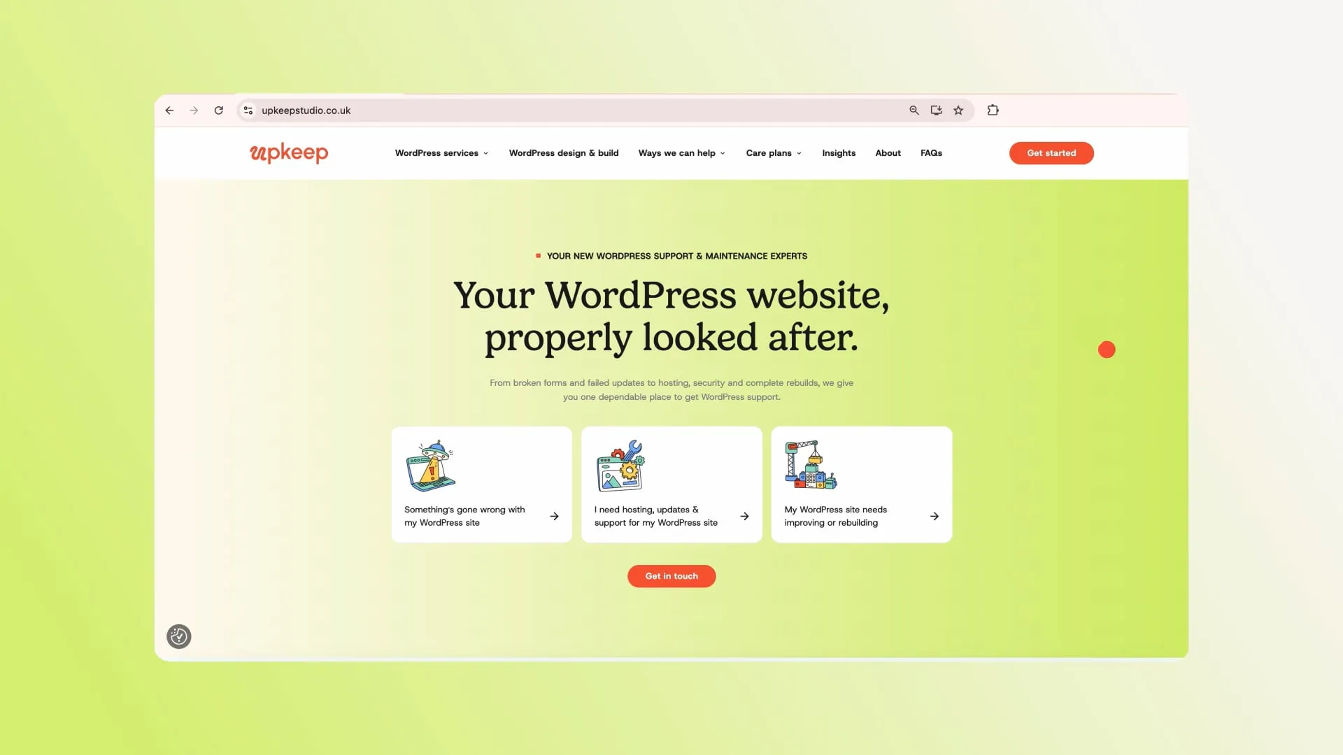
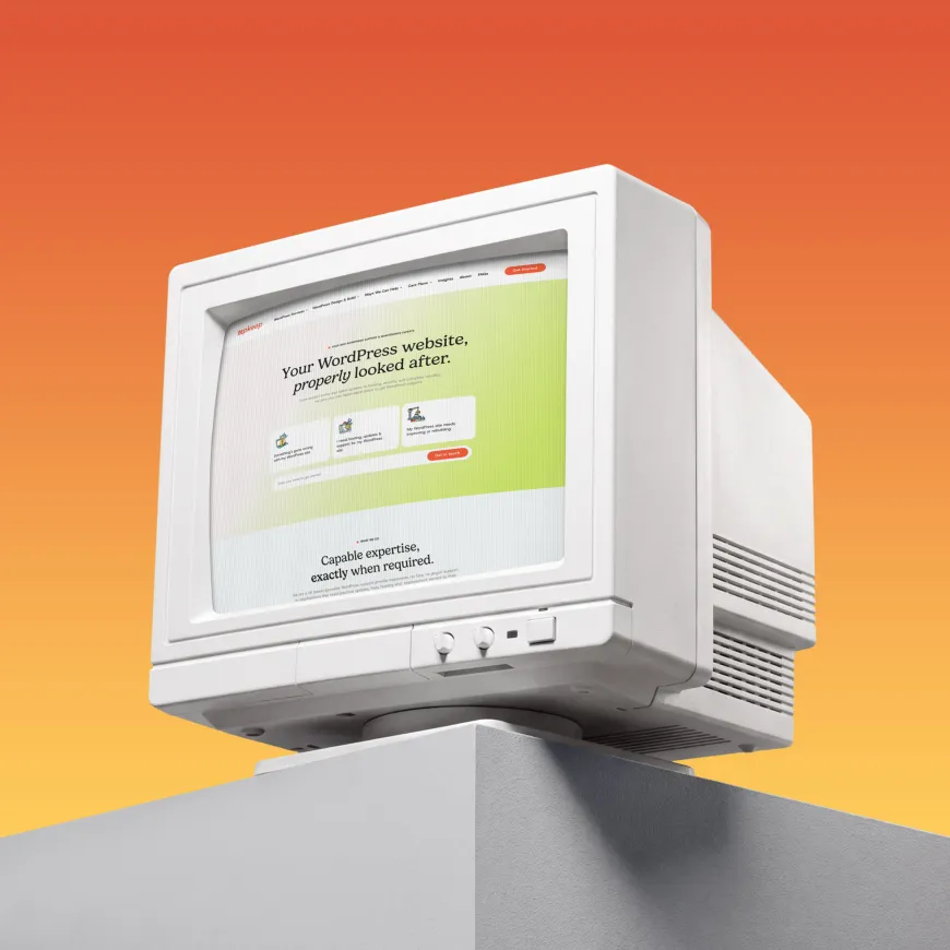
The website’s user experience starts with what the visitor needs to do. Someone with a broken website has different priorities from a marketing manager comparing ongoing support or a business planning a new build. We organised the site around those needs, creating clear routes into urgent WordPress support, website care, improvements and new website projects.
The interface combines illustrated service cards, straightforward explanations, visible pricing and clear calls to action. A consistent layout helps visitors move between services and understand the options without having to learn a new page structure each time.
The design principles are deliberately practical: make the offer easy to understand, make the information easy to scan and make the next step easy to find. Colour, typography and illustration give that experience its personality.

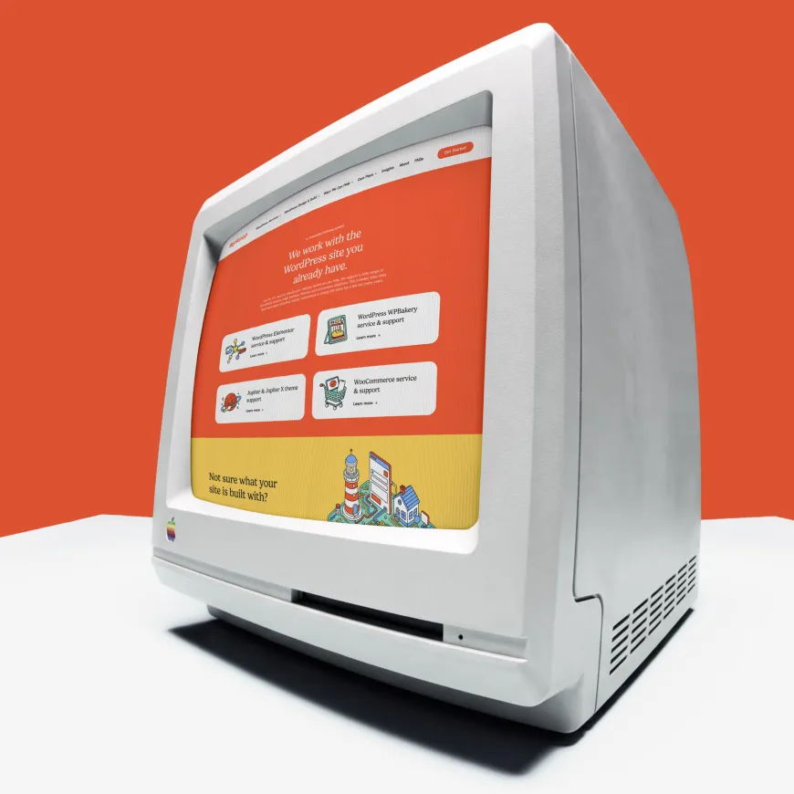
Performance was part of the brief from the outset. A brand promising to look after websites properly needed a digital presence built with the same care. We wanted to consistently hit 99 Lighthouse scores on page load. So that’s what we did. By developing Upkeep’s website using Astro and a headless architecture, we separate the presentation layer from its content source. This gives us control over the front-end design and delivery, with a technical foundation suited to a content-rich service website.
Astro’s HTML-first approach reduces the need for JavaScript in the browser, allowing interactivity to be added where it is useful. That supports our aim of delivering information quickly while retaining the visual detail that makes the brand distinctive. The choice reflects how we approach development at Think: understand the requirements, then select the technology that serves them. For Upkeep’s own marketing website, speed, content delivery and design flexibility were central considerations.


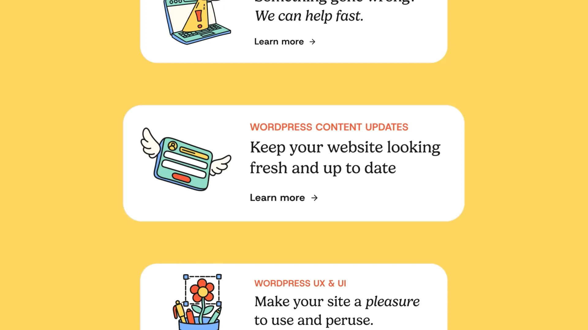
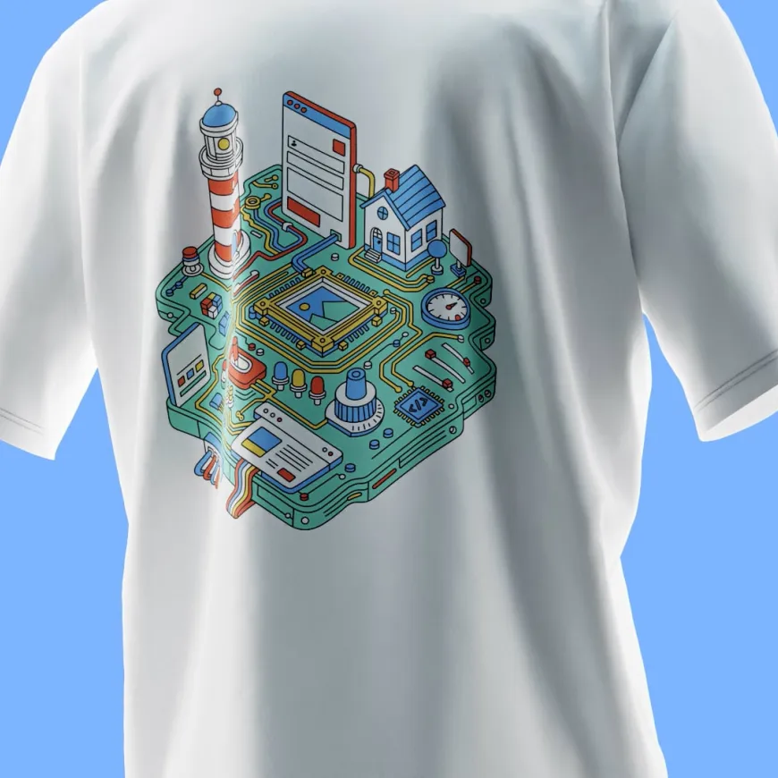
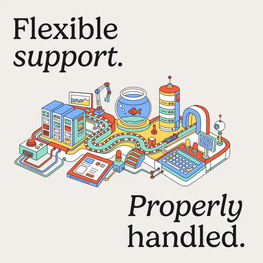
Illustration became a central part of the identity. We developed an extensive collection of colourful isometric illustrations, turning the often invisible work behind a website into something people can see and understand. Servers, browser windows, pipes, cranes, tools and interconnected machinery create a playful world of things being built, connected, repaired and kept moving.
The illustrations work at different scales. Smaller graphics give individual services a recognisable visual cue, while larger compositions bring several ideas together into detailed scenes. Shared linework, perspective and colour keep the collection cohesive as it expands. Across the website and wider brand applications, this gives Upkeep a substantial visual vocabulary. The same character carries through service information, editorial content, promotional graphics and merchandise, with enough variety to keep the brand interesting.

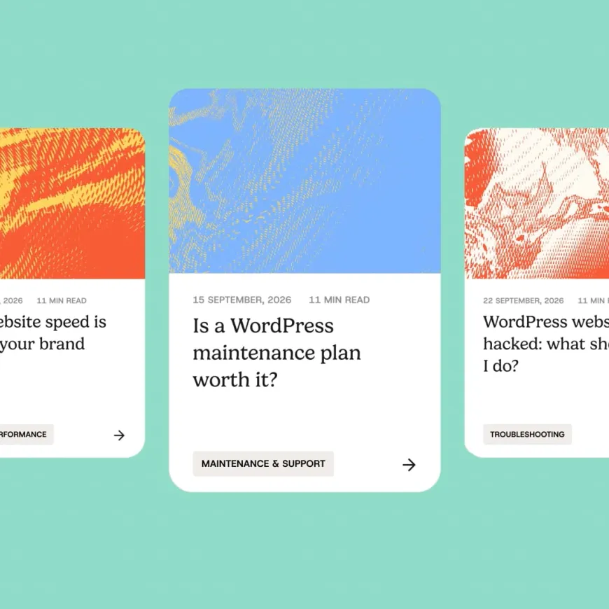
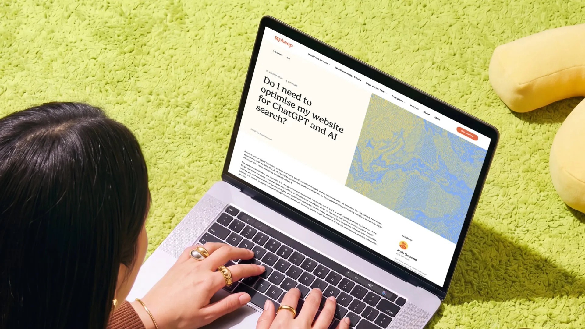
The content structure also gives Upkeep a foundation for organic search. Dedicated pages address specific needs across WordPress support, maintenance, managed hosting, performance improvements and website development. Platform-specific content covers familiar tools such as Elementor, WooCommerce and WPBakery, while support articles answer the practical questions people encounter when managing a website.
This connects the service offering with the language potential customers use when looking for help. Clear page topics, descriptive headings and relevant links between guidance and services help visitors move from understanding a problem to finding support. The same principle runs through the copy and the interface: be useful, explain things properly and make it straightforward to take the next step.