Propp
A Propper digital step forward
Harrap ICT needed a refreshed digital presence that could support the next stage of their business. As a well-established local business with strong recognition across Hampshire schools, the challenge was to modernise the brand without losing the trust, familiarity and human feel that existing clients already valued. The brief focused on a gentle brand refresh, keeping the Harrap logo recognisable while improving the colour palette, typography and overall visual consistency.
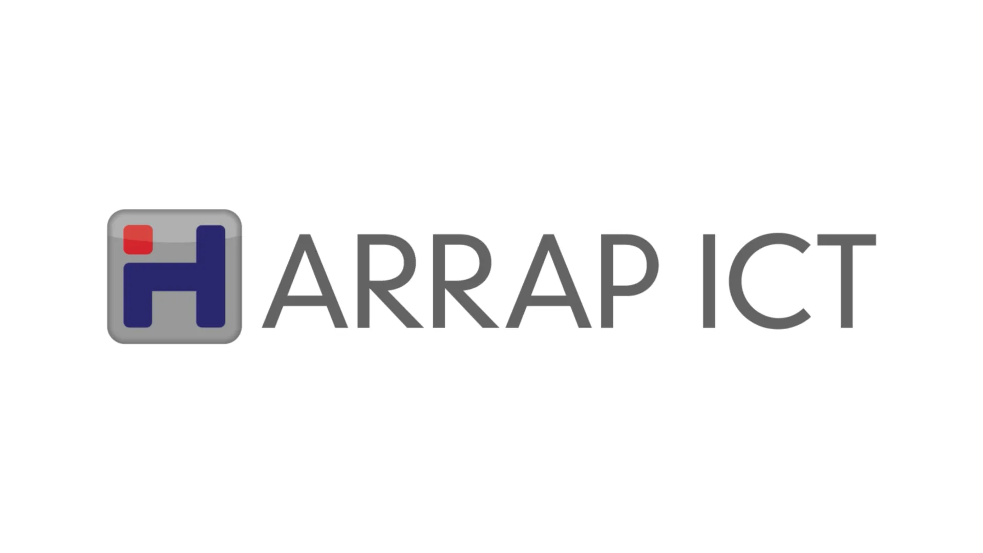



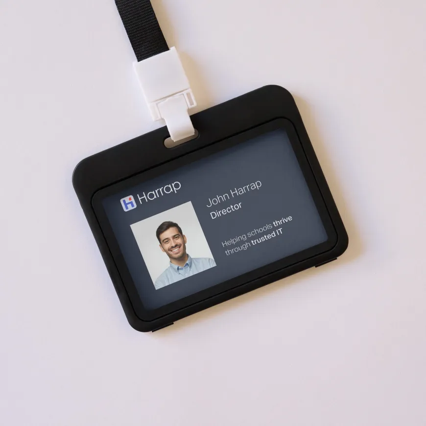
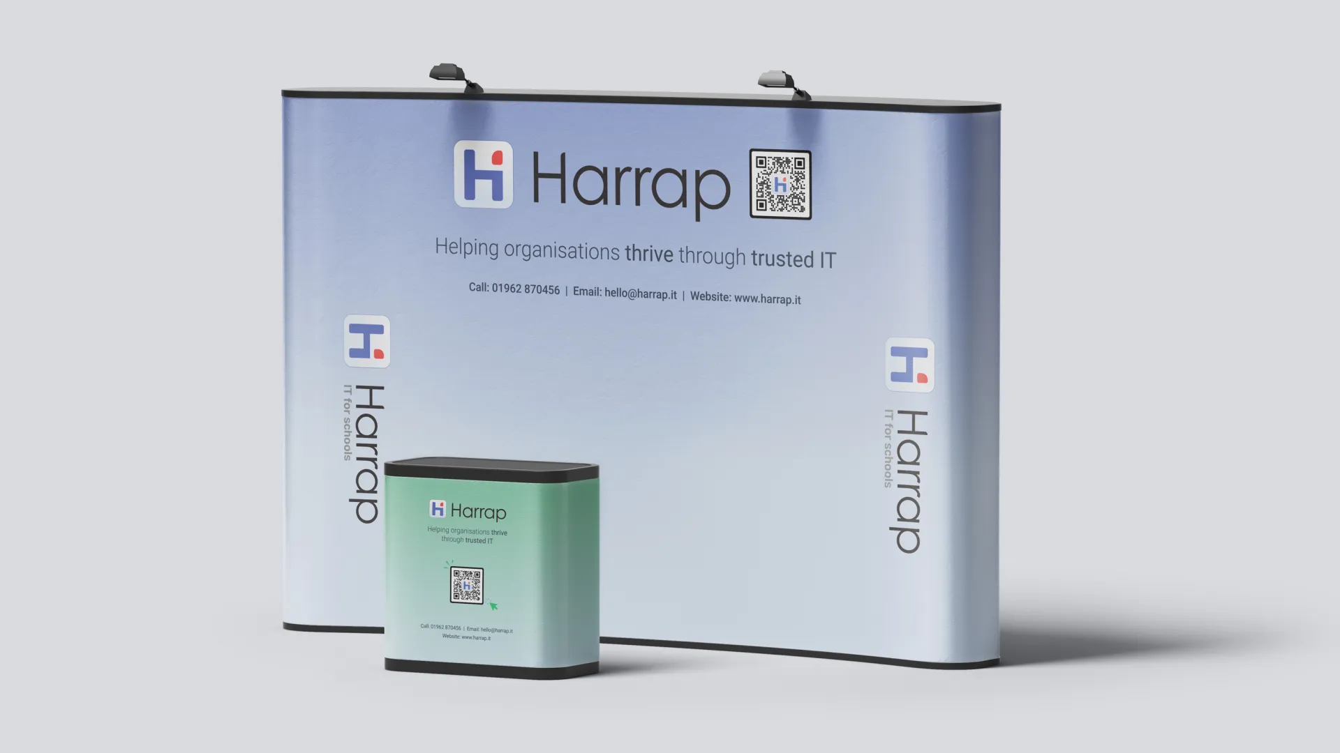
We created a cleaner visual identity for Harrap, built around a more confident logo suite, brighter supporting colours and friendly illustration-led assets. The refreshed style gives the brand more warmth and clarity, helping it feel approachable for schools while still presenting Harrap as a capable, professional technology partner. The identity was then carried through into practical brand applications, including digital layouts, team assets, display graphics and simple printed materials.
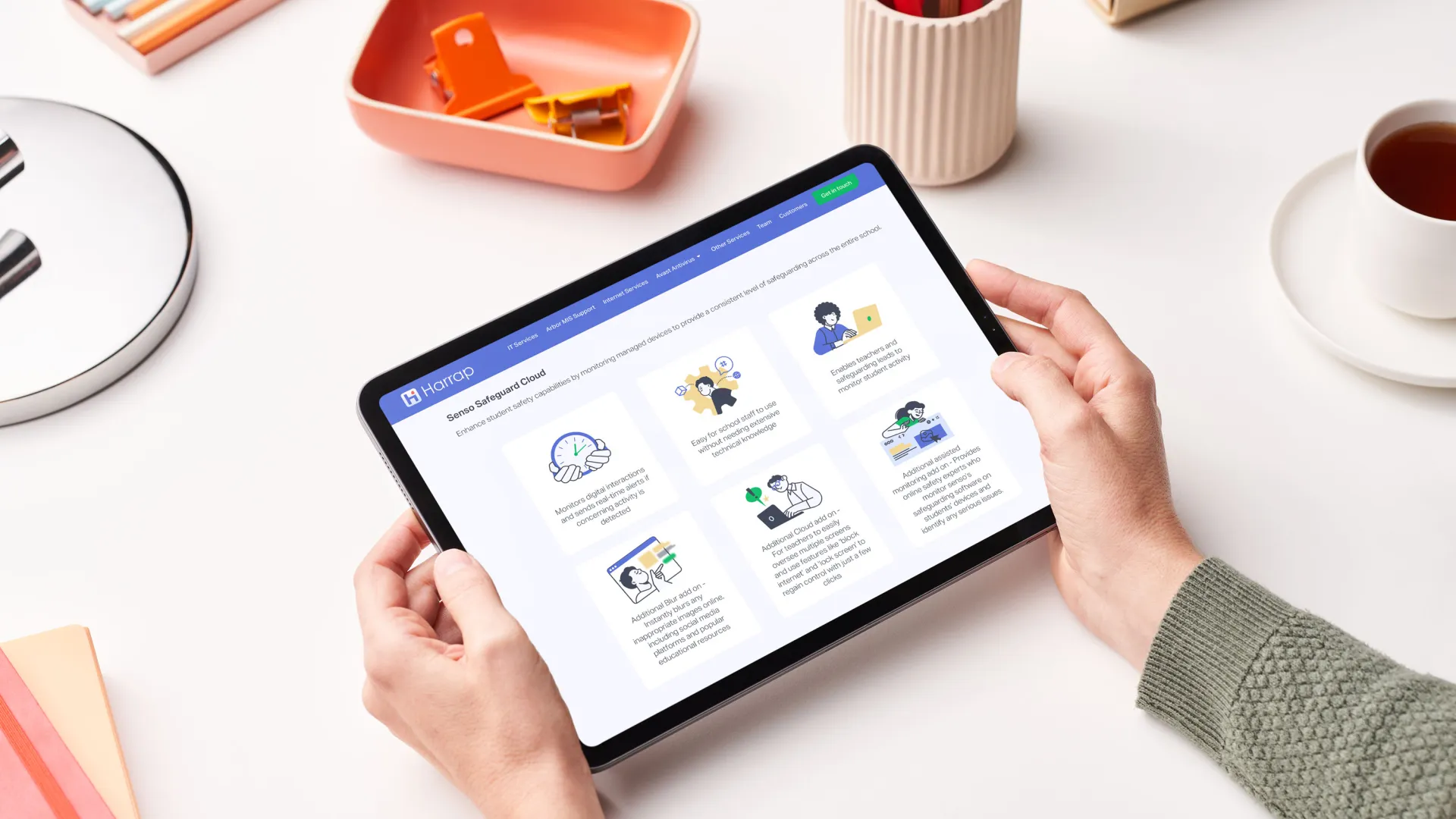
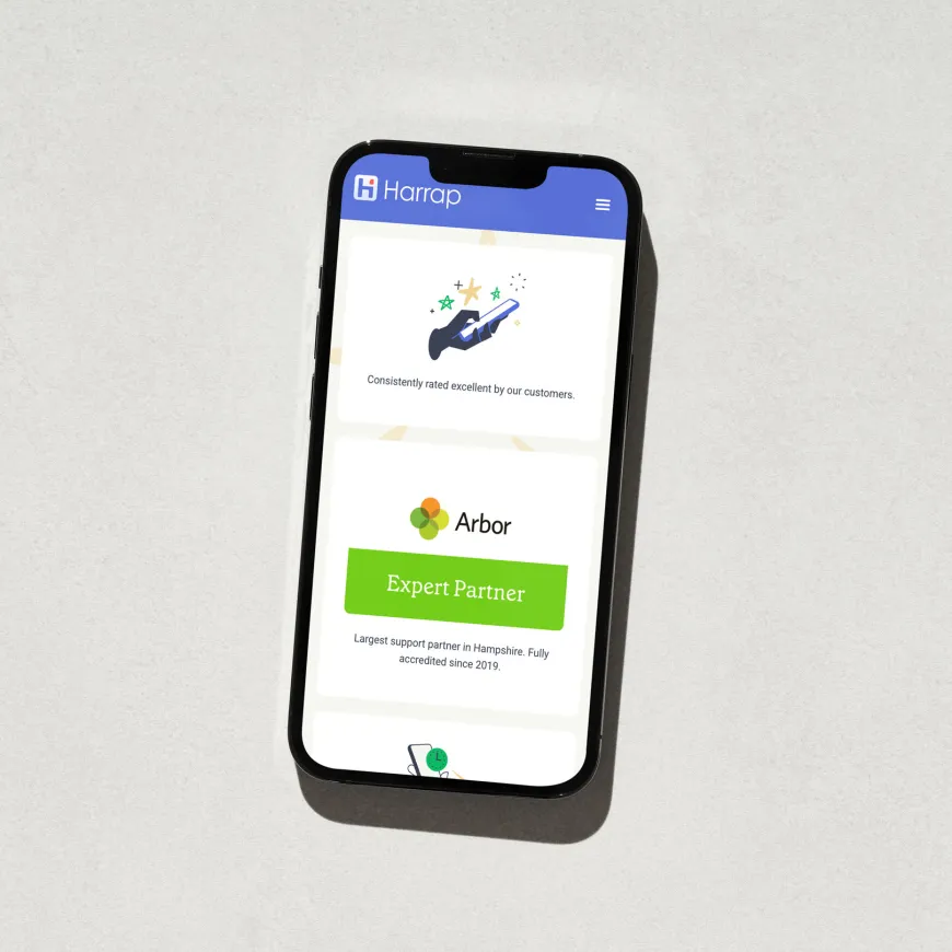
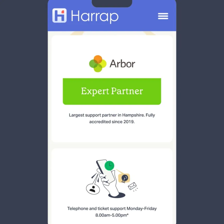
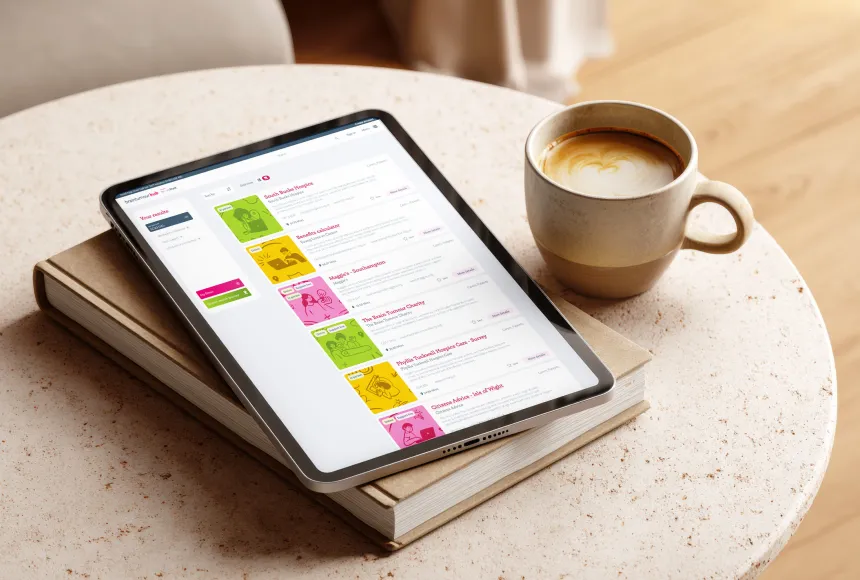
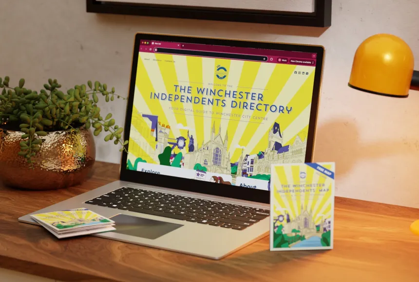
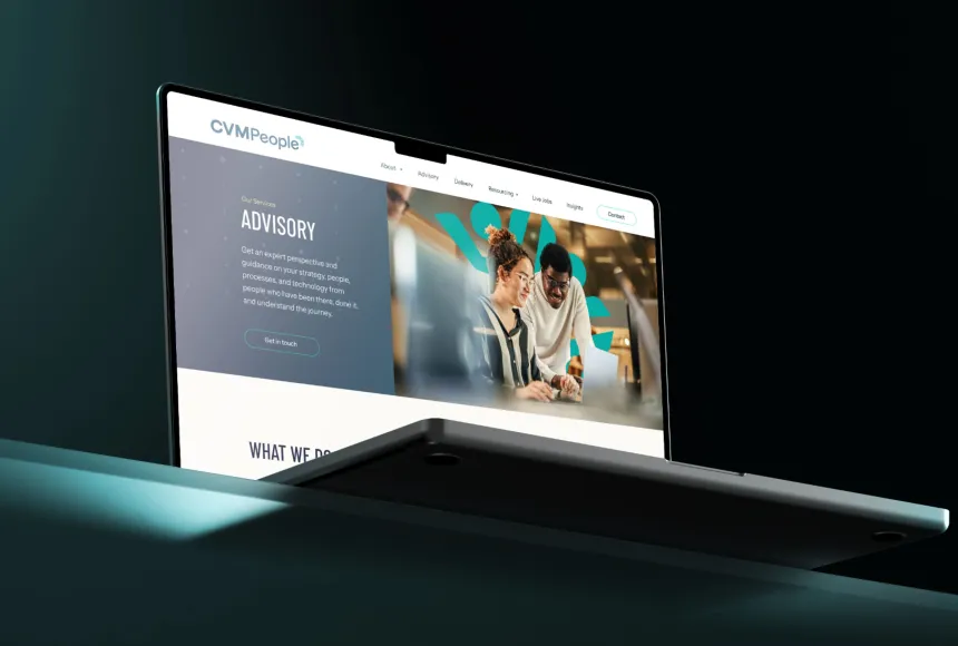
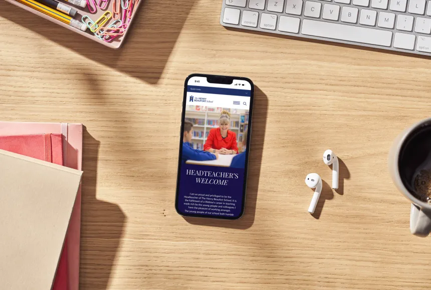
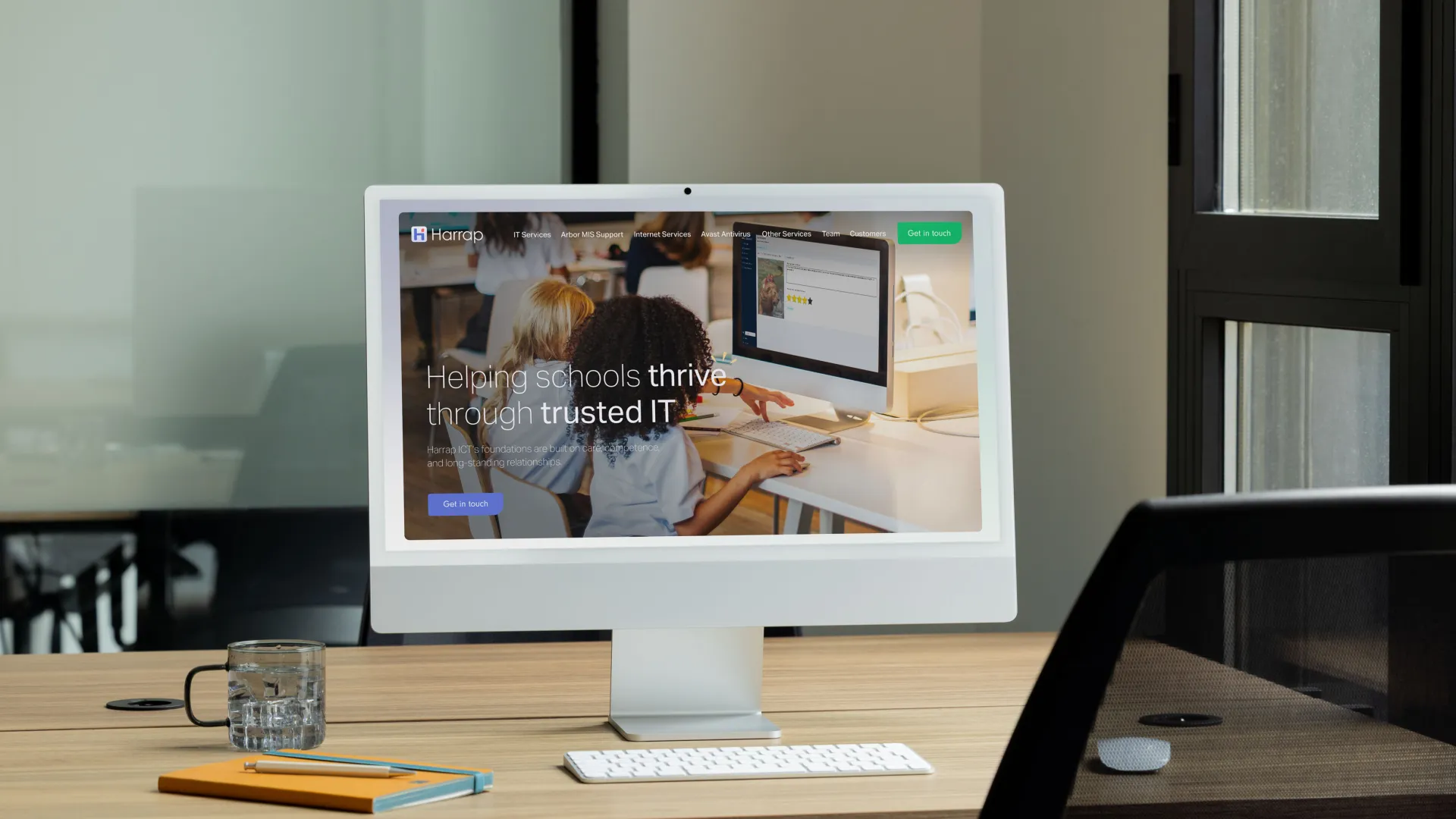
The new WordPress and Elementor website was designed to make Harrap’s services easier to understand, navigate and act on. Clearer page structures, stronger calls to action and service-focused content help guide users towards key areas such as Arbor MIS support, internet, firewall and wider school ICT services. The result is a modern, easy-to-manage Elementor website that gives Harrap a more polished online presence while staying true to the local, trusted character of the business.