Propp
A Propper digital step forward

The Henry Beaufort School holds a special place for us as two of our team members studied there, so when the opportunity arose to help them redefine their online presence, we knew we had to get involved. Their existing website was built in an education specific, technically limiting page builder and had grown over time into a sprawling 150-page structure that made it hard for users to find what they needed. Our goal was simple: create something more intuitive, more engaging, and more reflective of the school’s energy and ambition.
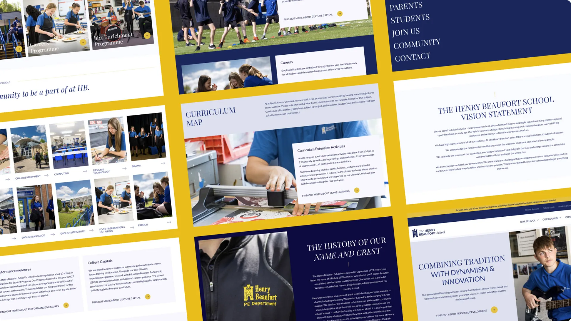
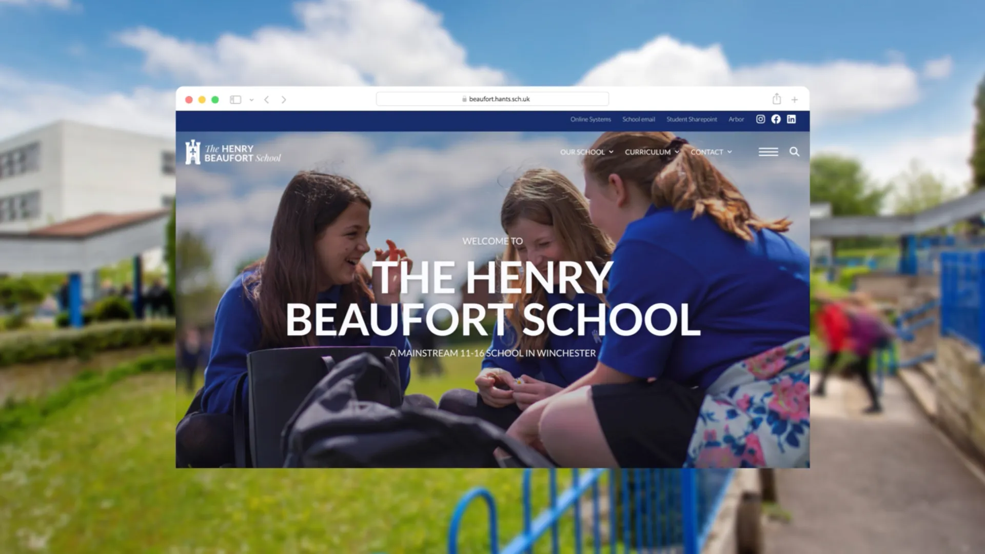
What began as an out the box templated educational website is now a website that feels alive, purposeful, and future-proof. Built with care and technical precision, it gives the school the tools to tell their story, showcase their achievements, and attract new students with confidence.
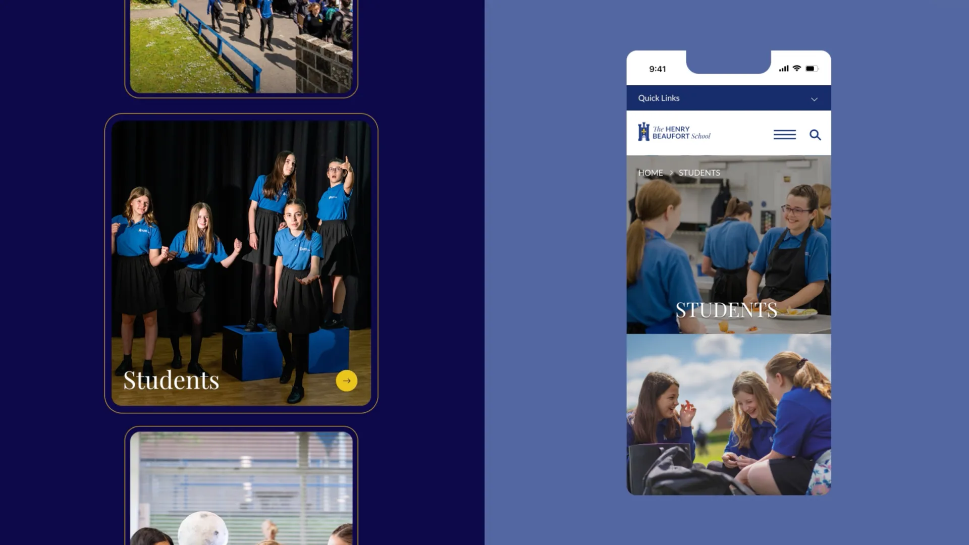
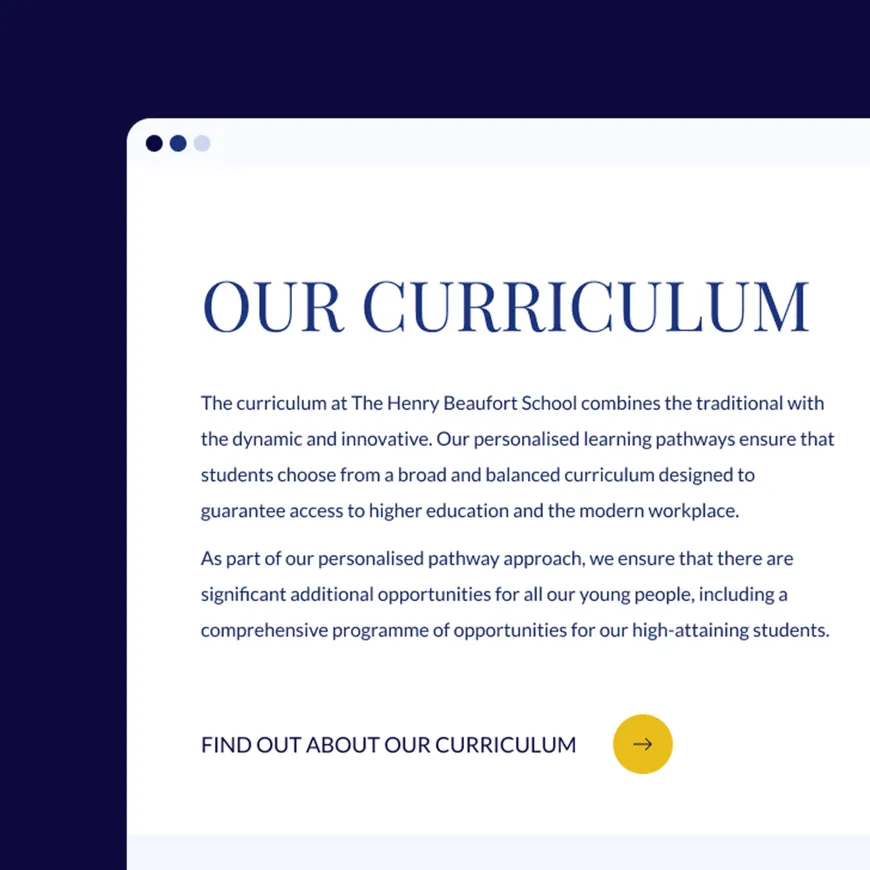
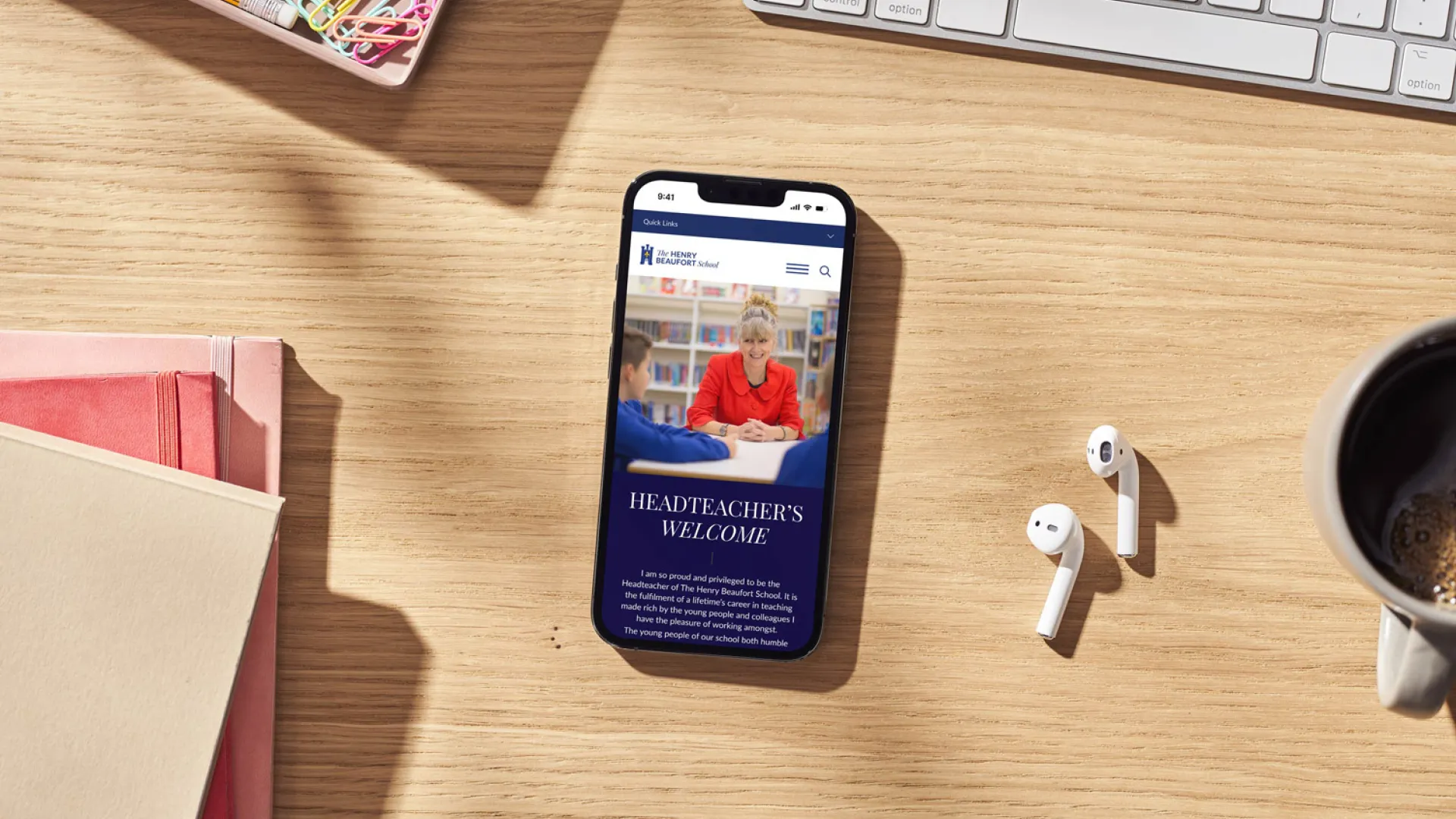
The new design is sleek, accessible, and aligned with Henry Beaufort’s refreshed brand. We introduced subtle animation, improved navigation, and a consistent visual rhythm that feels premium yet friendly. Every page now loads faster, performs better, and works beautifully across all devices. We worked towards the goal to ensure parents, students, and staff have a seamless experience wherever they are.
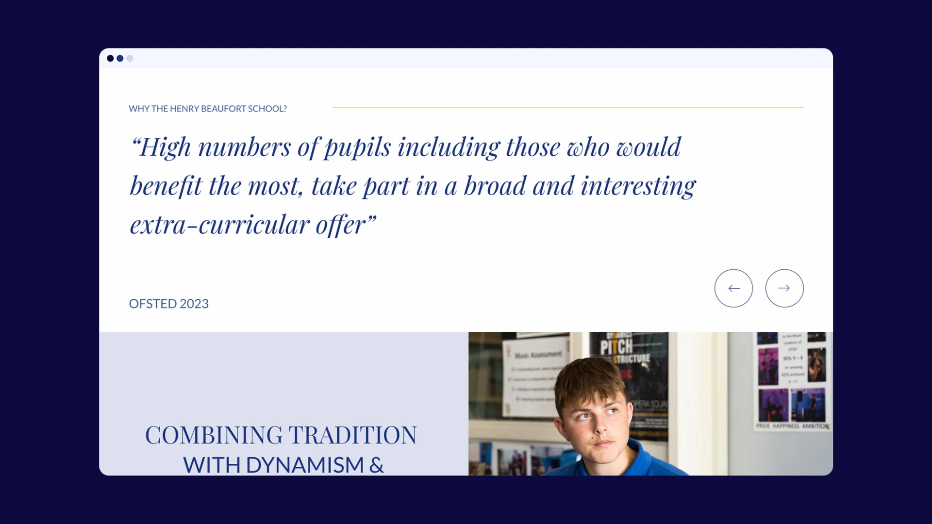

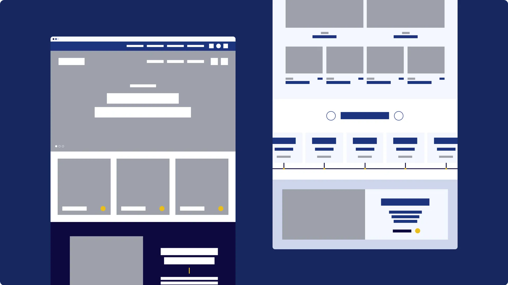
We began by mapping and consolidating the content, cutting the total number of pages by around 50% to create a clearer, more inviting user experience. From there, we designed a new modular system using custom Elementor and Advanced Custom Field components. This allowed us to quickly build dynamic, flexible page templates which meant creating all the pages was consistent across the site and giving the school the freedom to expand and evolve their site with ease.