Propp
A Propper digital step forward
For many small businesses, cash flow is not an abstract financial problem. It is the difference between waiting and moving. Between being stuck and getting on with the next job. Clear Factor was created to help SMEs release cash trapped in unpaid invoices. As the UK’s first fully digital invoice finance marketplace, the platform allows trade investors to compete for SME invoices, creating a more transparent and accessible route to working capital.
For many small businesses, cash flow is not an abstract financial problem. It is the difference between waiting and moving. Between being stuck and getting on with the next job. Clear Factor was created to help SMEs release cash trapped in unpaid invoices. As the UK’s first fully digital invoice finance marketplace, the platform allows trade investors to compete for SME invoices, creating a more transparent and accessible route to working capital.
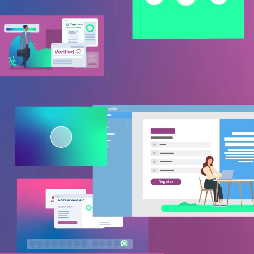

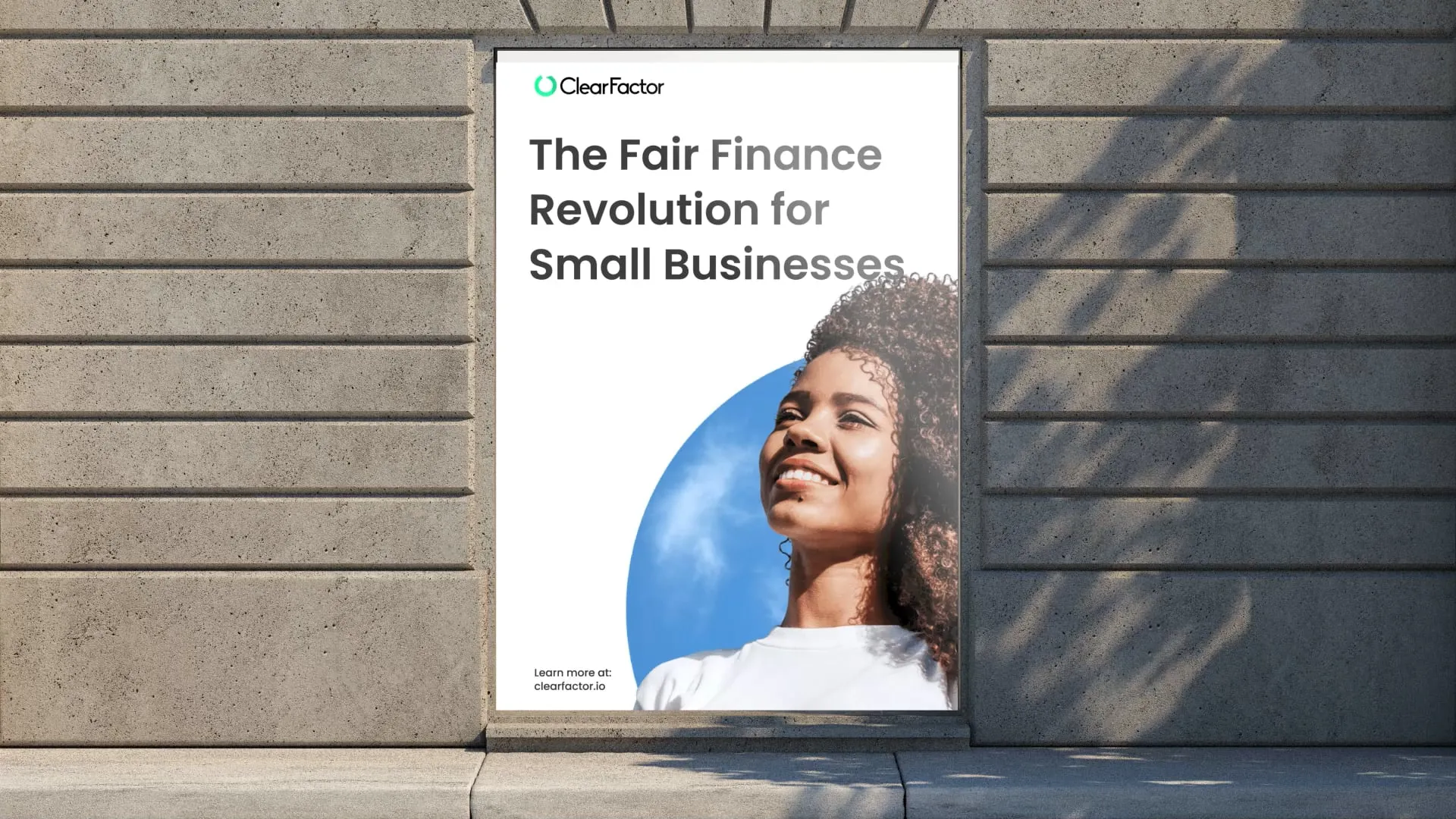
We worked with Clear Factor to turn the foundations of a logo and typeface into a fully fledged fintech brand identity across digital, motion and print. The goal was to make invoice finance feel less complex, less corporate and more useful to the businesses it was designed to help. The identity was built around openness and accessibility. Bright colours, bold typography and clean interface-led layouts gave the brand a vivid, modern feel, while a simple illustration and icon system helped explain the different roles within the Clear Factor ecosystem.
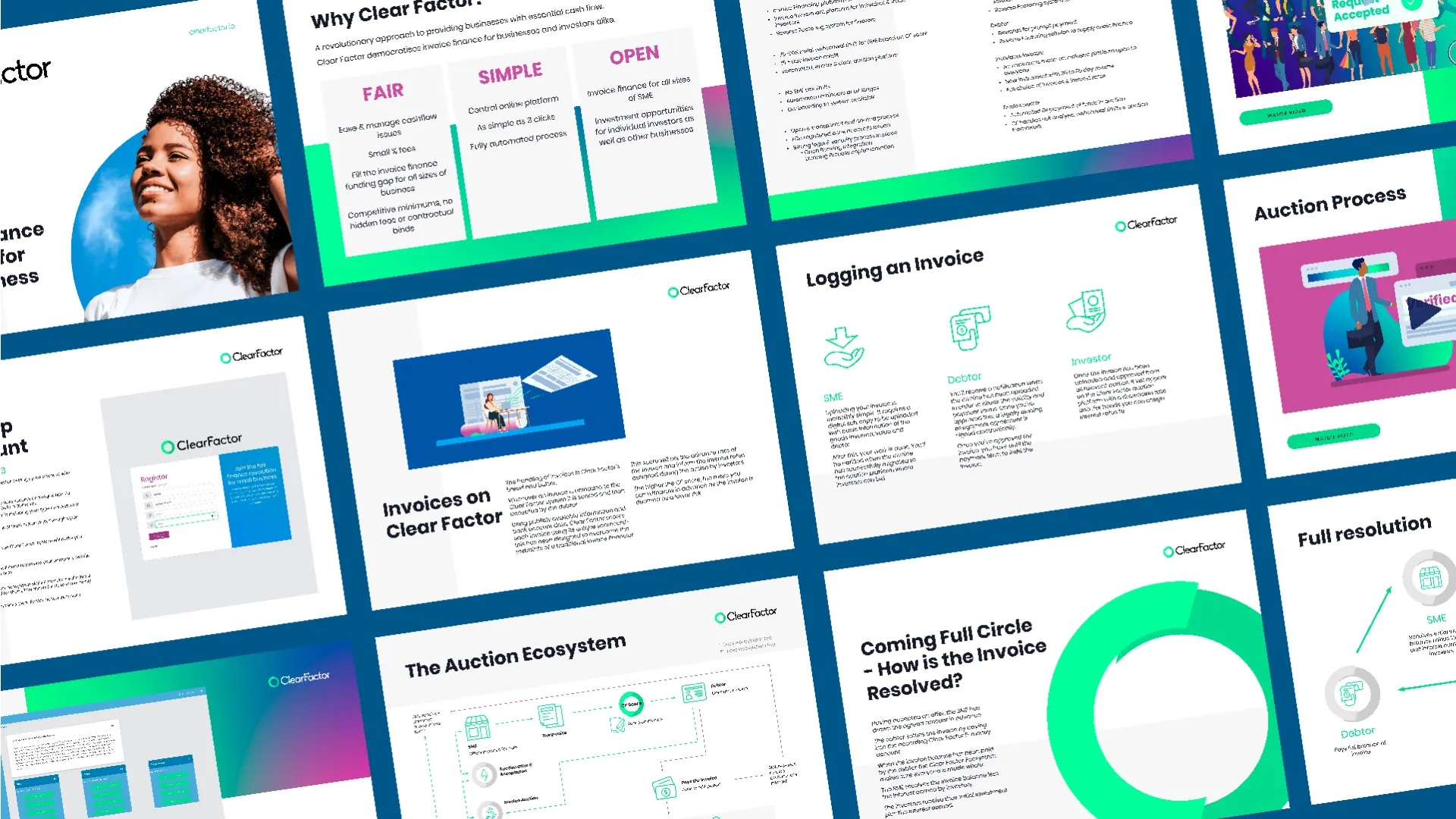
We started with presentation materials for investors and partners, creating a suite of pitch decks that made the platform easier to understand and easier to sell. From there, we developed animated explainer videos using smooth transitions, simple visual metaphors and clear messaging to show how SMEs, debtors and trade investors move through the process.
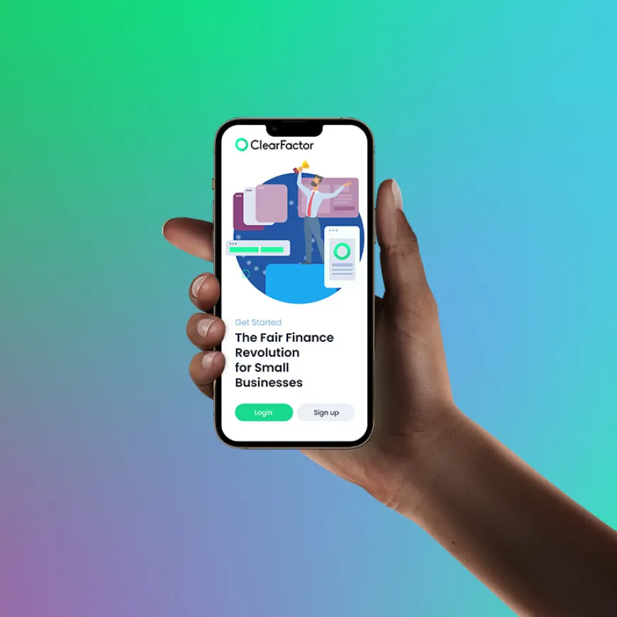
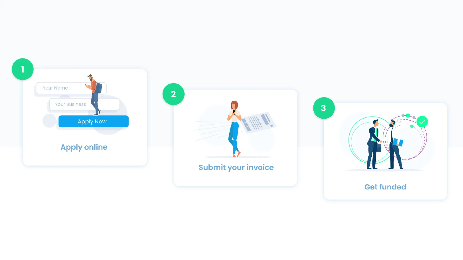
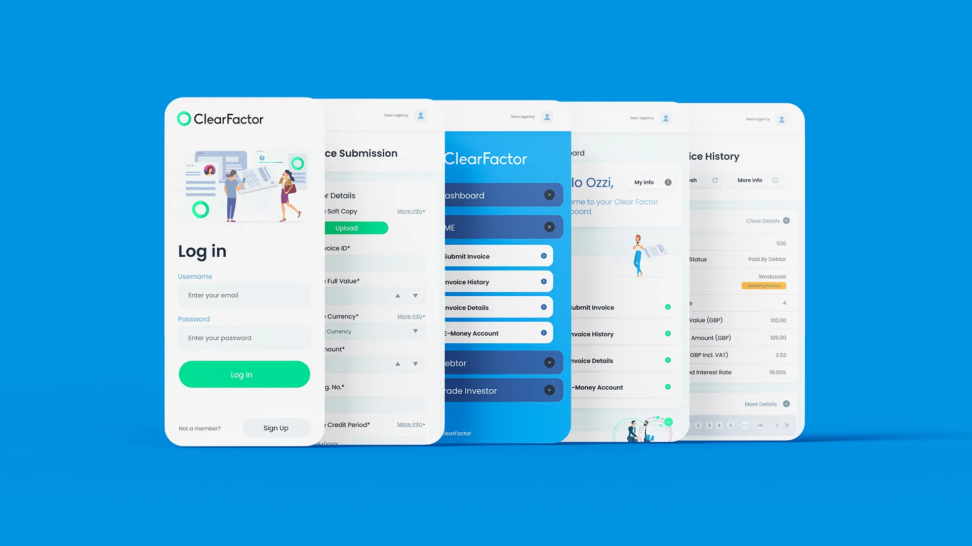
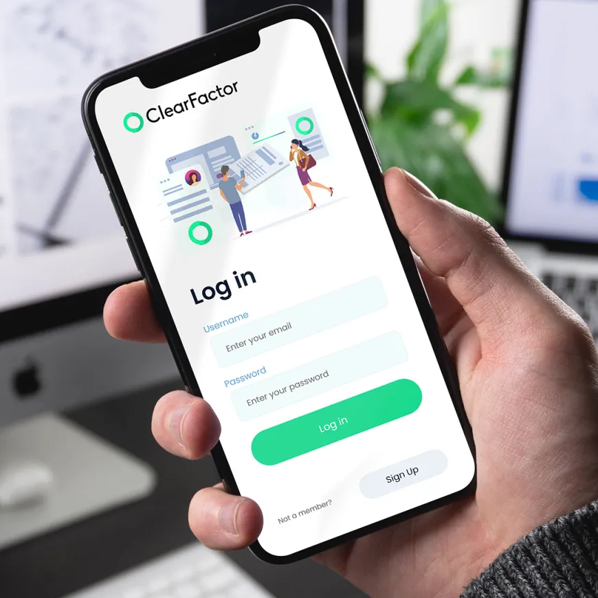
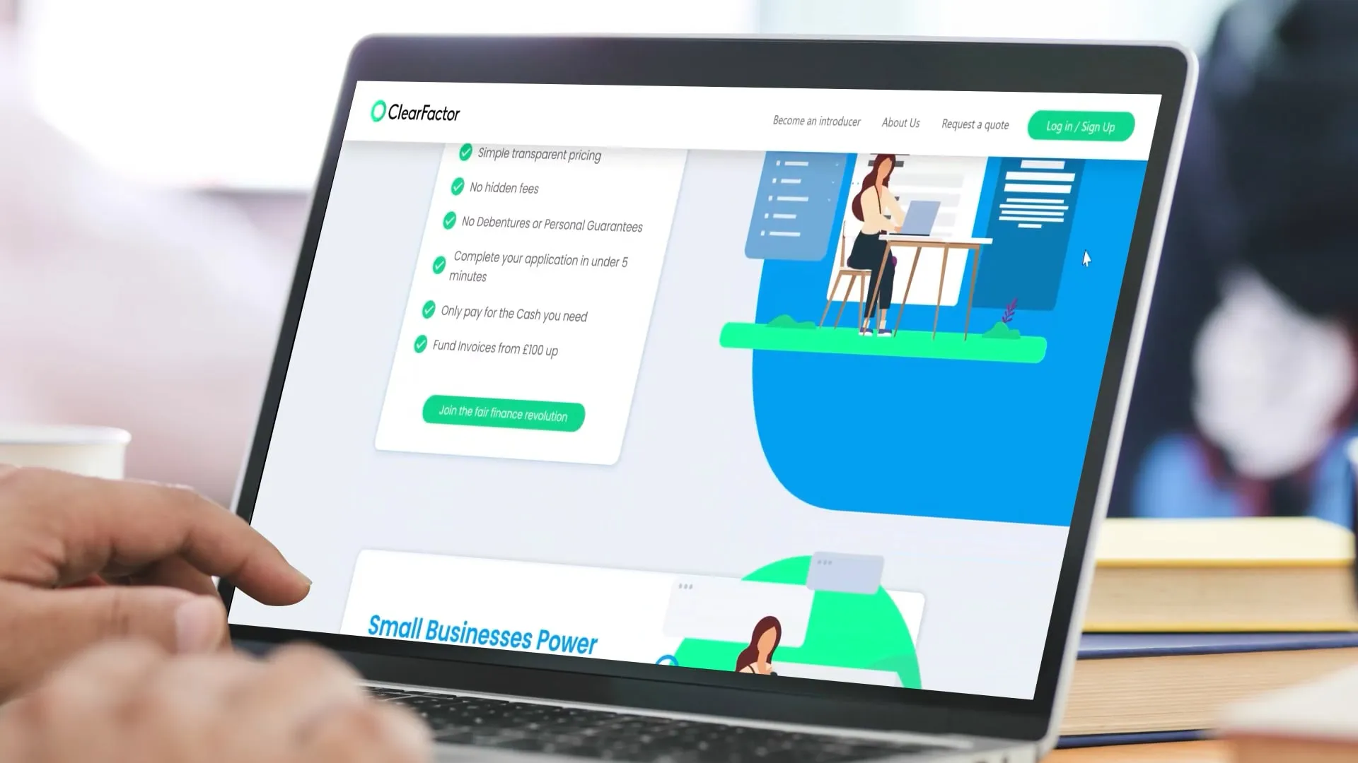
The website carried the same thinking into a public-facing digital experience. Designed to market and convert SMEs, the site used a minimal layout, concise content and animated graphics to explain the offer quickly. No unnecessary friction. No overcomplication. Just a clearer way into finance. We then applied the visual system to the product itself, designing the mobile app UI and UX around simple navigation, clear forms and accessible information. From invoice submission to finance history, the interface was designed to help users understand where they are, what they need to do and what happens next.