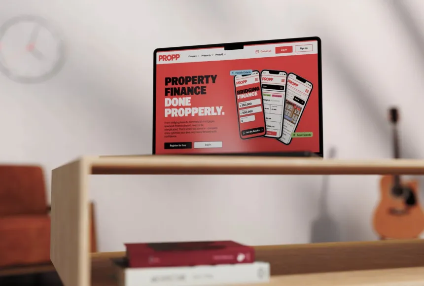
Propp
A Propper digital step forward

China is one of the most powerful commercial markets in the world. It is also one of the hardest to understand from the outside. For Western brands, success is not simply a question of translation. It is about trust, timing, culture, data, digital behaviour and knowing how people make decisions. Qiva Global exists to make that complexity clearer.
As an operating partner for brands entering the Chinese market, Qiva needed an identity that could hold two worlds together. Data-led but human. Premium but practical. Culturally aware without leaning on the obvious tropes.
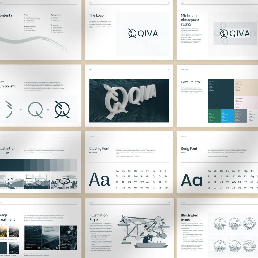
Think Creative created a brand identity and visual system built around the contrast between complexity and clarity. Qiva operates in a fluid, fast-moving and often turbulent market. Their value lies in bringing structure to that movement: using insight, process and digital strategy to help brands stand out, build trust and grow.
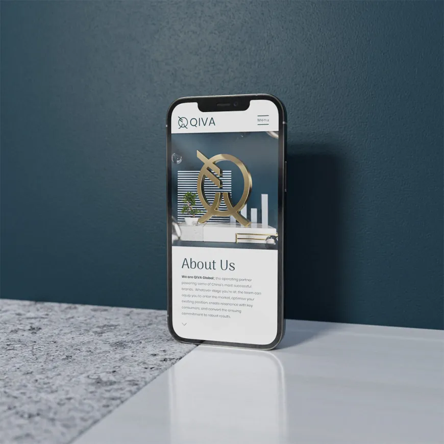
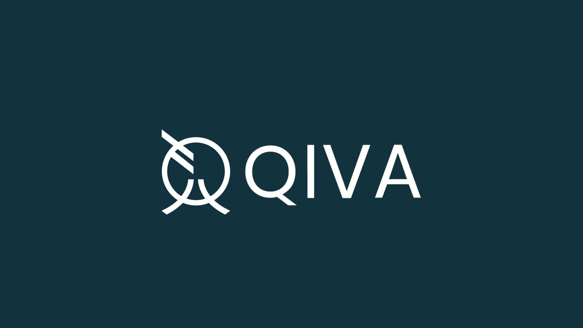
The logo mark brings together Eastern and Western forms in a subtle, considered way. Inspired by qīng. A word connected to clarity, purity, honesty and distinction, the icon references the Chinese character associated with water, suggesting movement, transparency and flow. Combined with the Latin “Q”, it becomes a symbol of connection: a bridge between Western brands and Chinese markets.
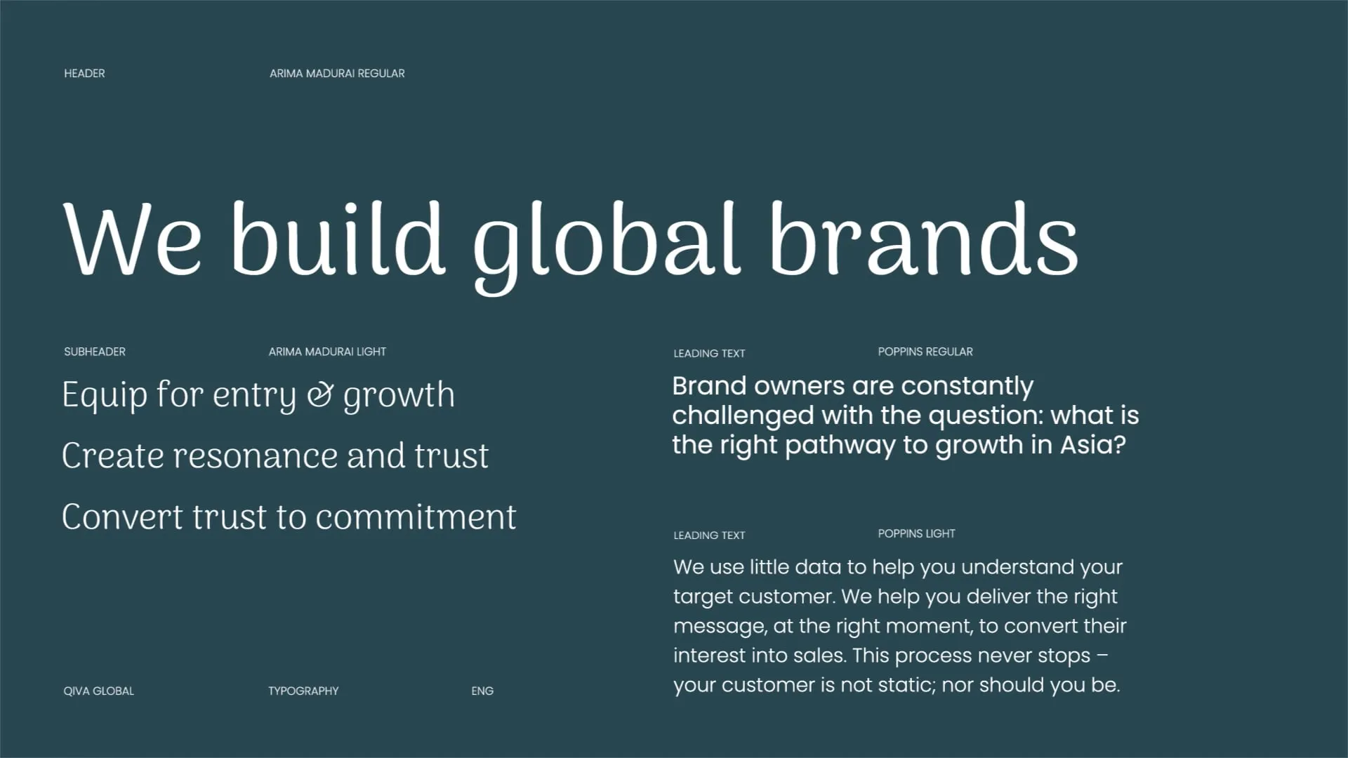
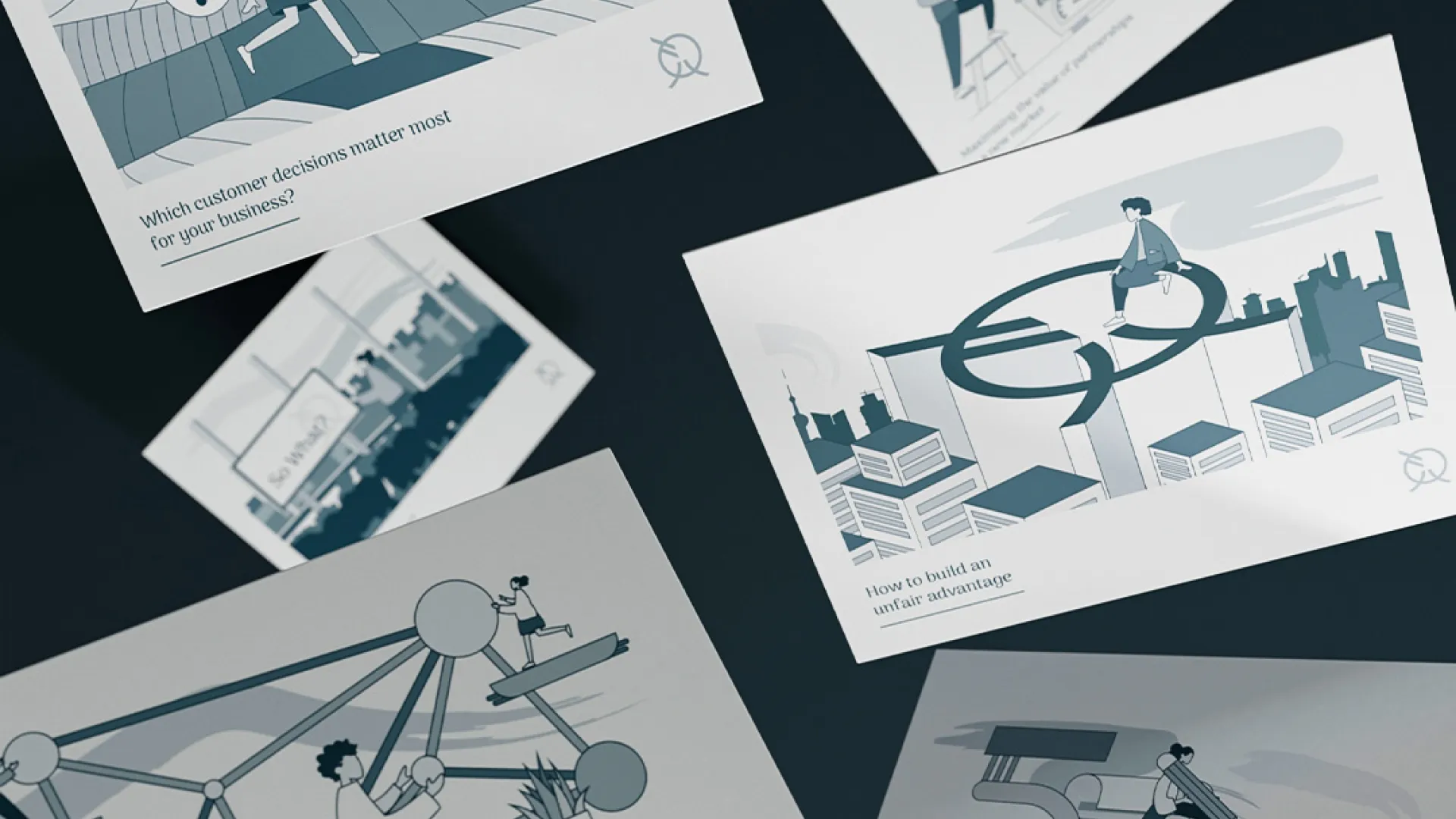
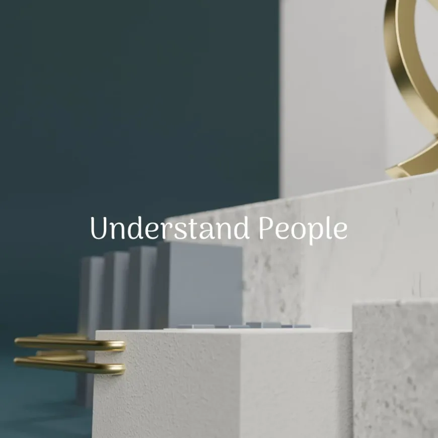
Around the mark, the visual language balances precision and expression. Geometric grids, clean layouts and structured typography create a sense of confidence and control. Layered illustration, CGI and architectural forms introduce movement, depth and cultural reference. The identity draws from Chinese calligraphy, architecture, porcelain and interior detail, but avoids the overused visual shorthand that often flattens cross-cultural branding.
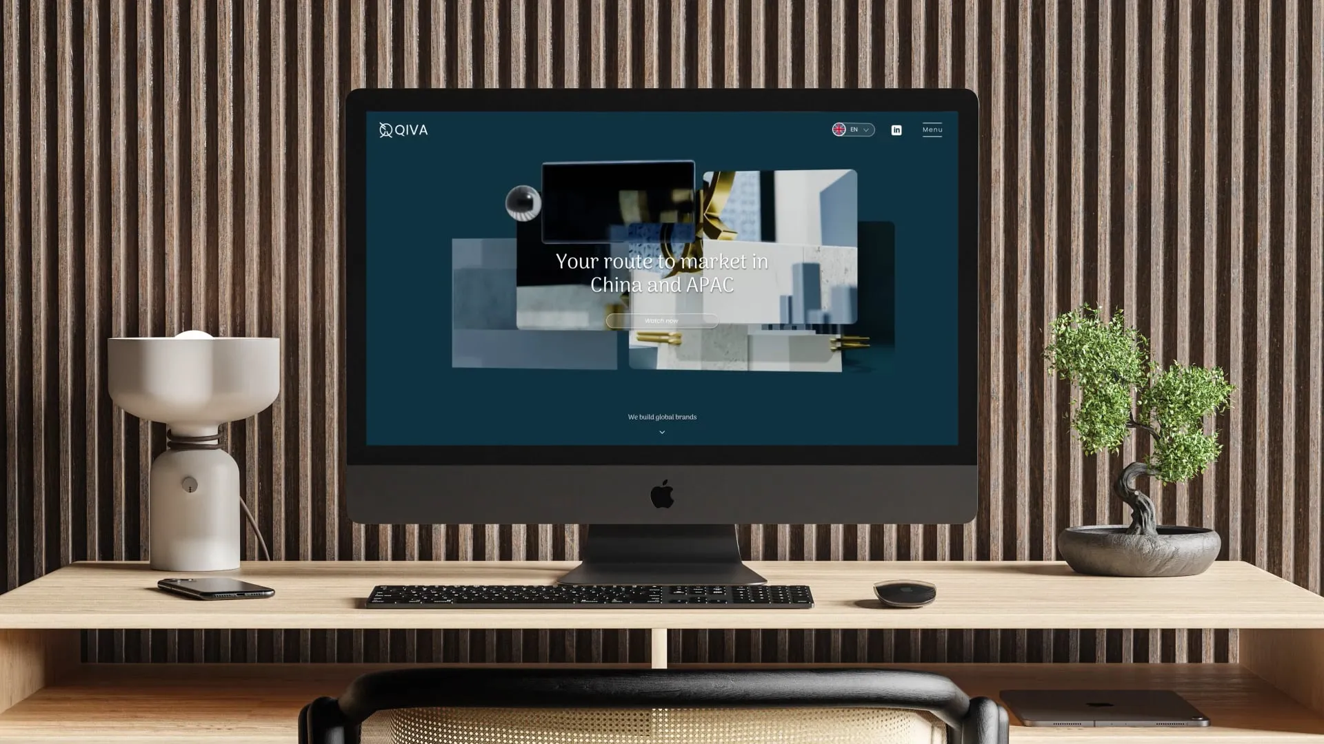
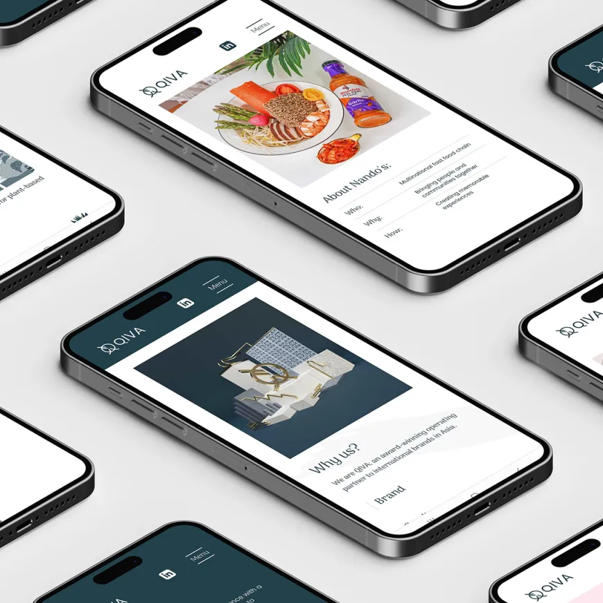
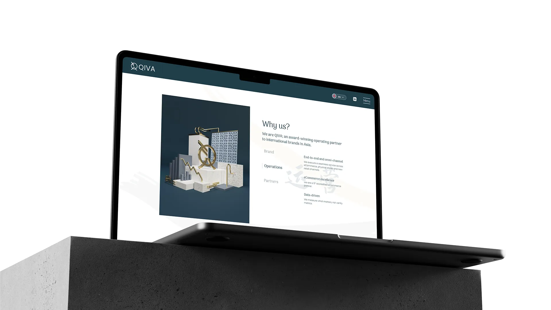
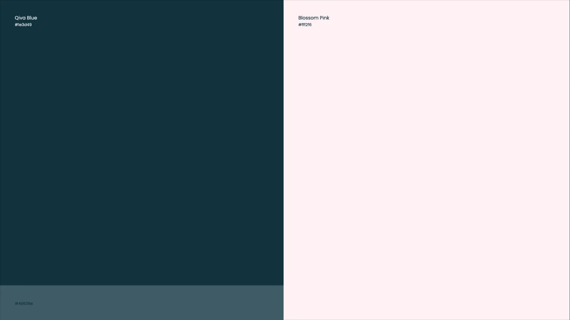
The colour palette adds another layer of meaning. Deep blue, soft blossom pink, ceramic white and restrained gold take inspiration from ancient Chinese pottery and material craft. Premium without being loud. Elegant without being fragile. To support Qiva’s omnichannel offer, we developed a flexible image system spanning CGI, digital illustration, photography, website animation and brand collateral. Marble, gold, concrete, metal and plaster were used as visual metaphors for strength, value and permanence.
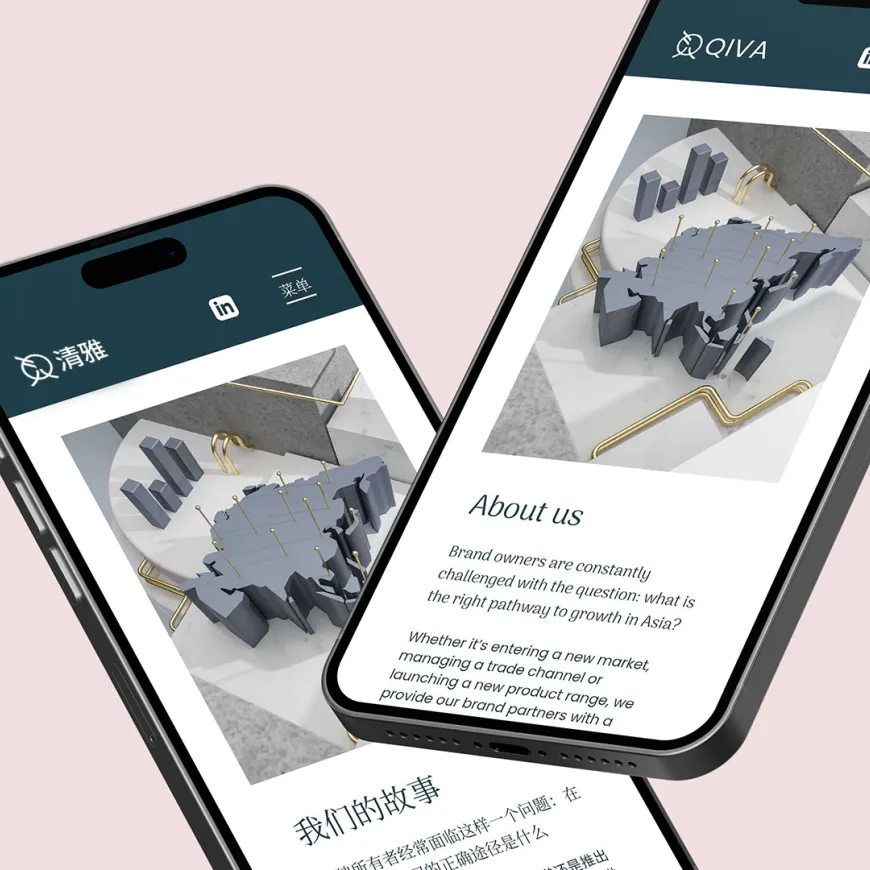
The finished identity works across English and Mandarin, digital and print, strategy documents and animated web content. A brand system designed to help Qiva Global communicate authority, cultural intelligence and commercial clarity in a market defined by movement.