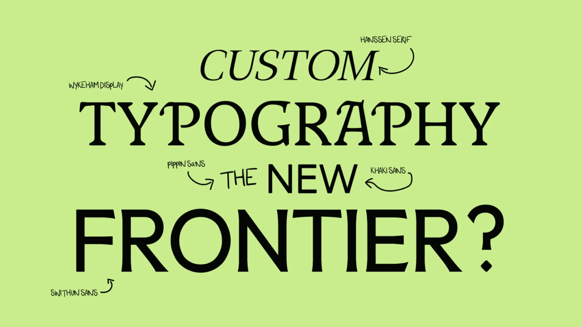
I've developed a bit of an obsession with custom typography recently. It's something I've always appreciated as a designer, but the more we explore it at Think, the more I see it as an exciting opportunity in branding. Not necessarily because it's new, but because of how much character and distinction it can bring to a visual identity, particularly when it's applied consistently across everything a brand does.
Custom typography sounds expensive, and quite frankly, it can be. Designing a fully functioning typeface from scratch is an enormous undertaking. Once you begin considering multiple weights, italics, hundreds or thousands of glyphs, ligatures, kerning and the painstaking work required to make everything function together, you start to appreciate just how much craft goes into something most people barely give a second thought. It's no surprise that major global brands invest significant amounts of money developing their own typefaces. But what's interesting to me is that the opportunity isn't limited to organisations with enormous branding budgets. There's a great deal of territory between choosing something off the shelf and commissioning an entire bespoke font family, and we've been having a lot of fun exploring it.
Why Typography Matters So Much To A Brand
I've always felt that typography is one of the most important elements of a strong visual identity, arguably even more important than the logo itself. That's because it's one of the few things within a brand's arsenal that has to work almost everywhere. From an enormous billboard to a tiny button on a website, printed brochures, packaging, presentations, signage and everyday emails, typography carries an extraordinary amount of responsibility. It's also the visual expression of your tone of voice. The words you choose might communicate one thing, but the way those words look introduces another layer of personality before anyone has even finished reading them.
There are thousands of bloody good existing typefaces, many of which can express a brand's character beautifully. But there's something quite compelling about being able to shape those letterforms around the identity itself, whether that's introducing a little warmth, refining proportions or developing something entirely distinctive. When typography has been considered as part of the brand strategy rather than simply selected towards the end of a project, it becomes another way of communicating the organisation's values and personality. Sometimes the changes are deliberately subtle. Other times, typography becomes the most expressive part of the entire identity.

Making Something Your Own
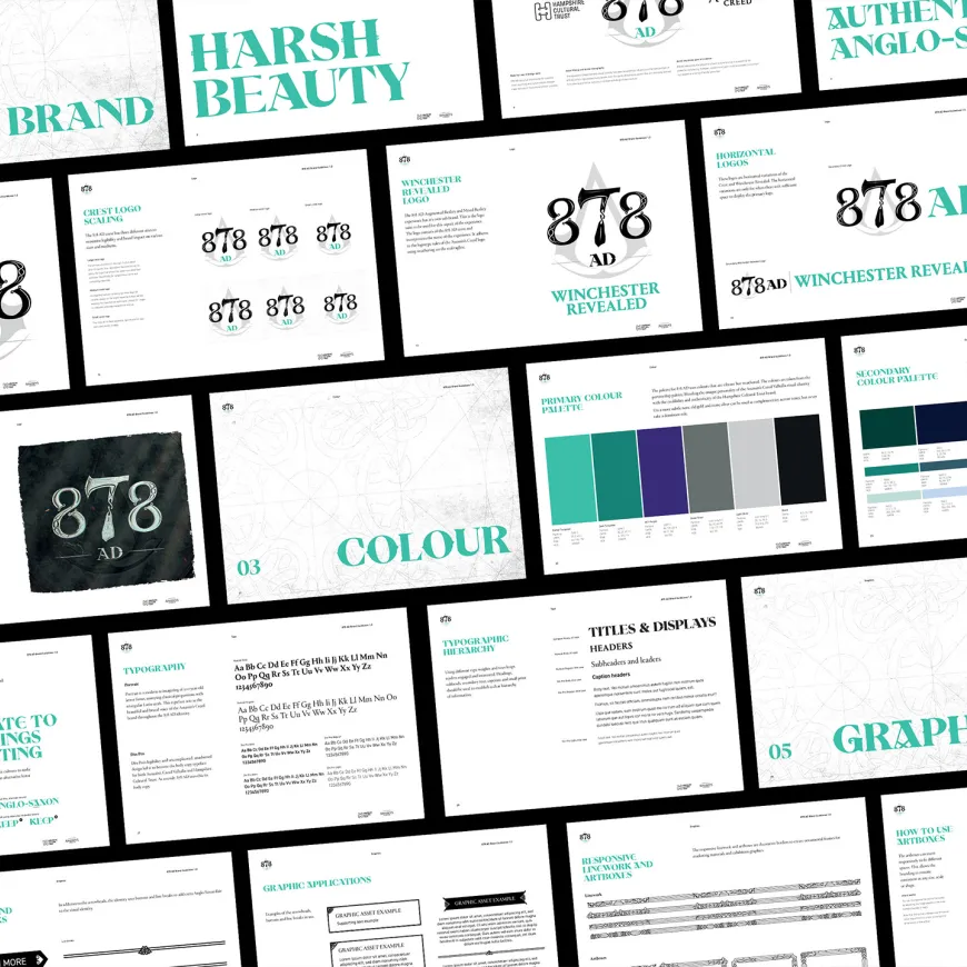
One of the approaches we've been exploring at Think is modifying existing typefaces rather than designing every character from scratch. There are some brilliant open-source fonts available through Google Fonts, many of which are distributed under the SIL Open Font License. This generally allows commercial use and modification, subject to conditions around licensing, attribution within redistributed font files and, where applicable, reserved font names. It creates a wonderful opportunity to work with an already well-considered foundation and develop something more specific to the identity we're building.
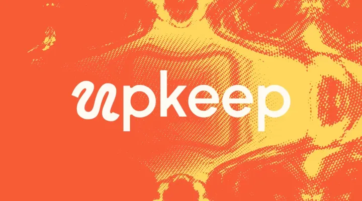
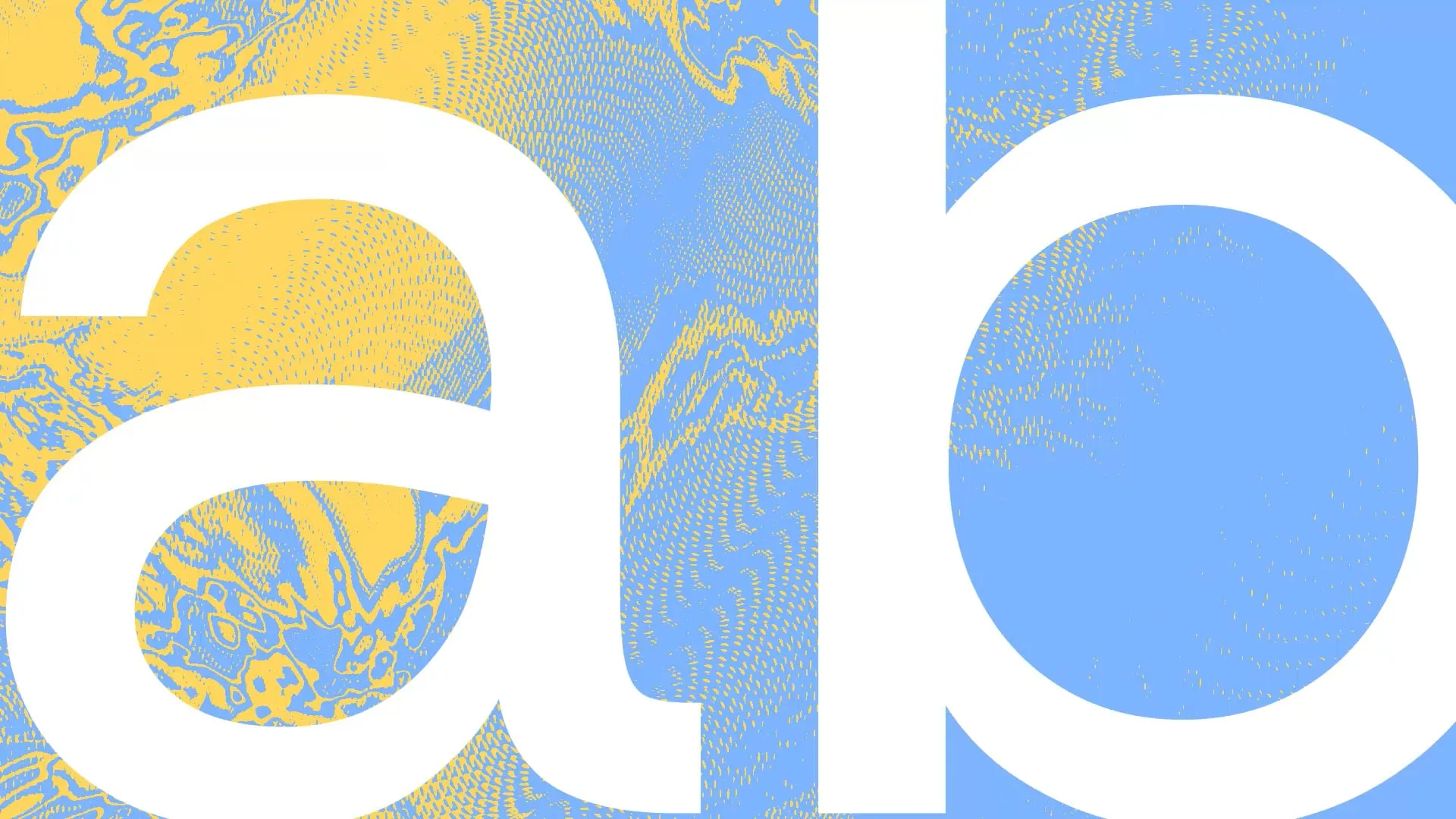
A good example is Upkeep Sans, which we created for Upkeep, our WordPress support and development brand. We started with Host Grotesk, an open-source typeface, and made a series of adjustments to the letterforms. Some of the changes involved softening and rounding particular details to introduce a more organic character, while others exaggerated aspects of its technical, structured appearance. The result sits somewhere between friendly and functional, reflecting the balance we wanted Upkeep to communicate. These aren't enormous alterations, and most people encountering the brand probably won't realise that the typography has been modified at all. But that's partly what I enjoy about it. Those small decisions contribute to something that feels considered and more closely connected to the rest of the identity.
There's a practical advantage to this approach too. By retaining a close relationship with an established typeface, we have a sensible fallback when the custom font cannot be used. Certain email platforms, document tools and third-party applications restrict which fonts you can install or display, so having a closely related alternative can help preserve the character of the brand in those environments. It won't be completely identical, but it gives us another way to maintain consistency without compromising usability. It's also an example of how relatively modest adjustments can add meaningful personality without the expense of developing a complete type family.
When Typography Becomes Personal
Of course, there are projects where starting with an existing typeface isn't really the point. Sometimes the most interesting opportunity comes from something much more personal to the organisation.
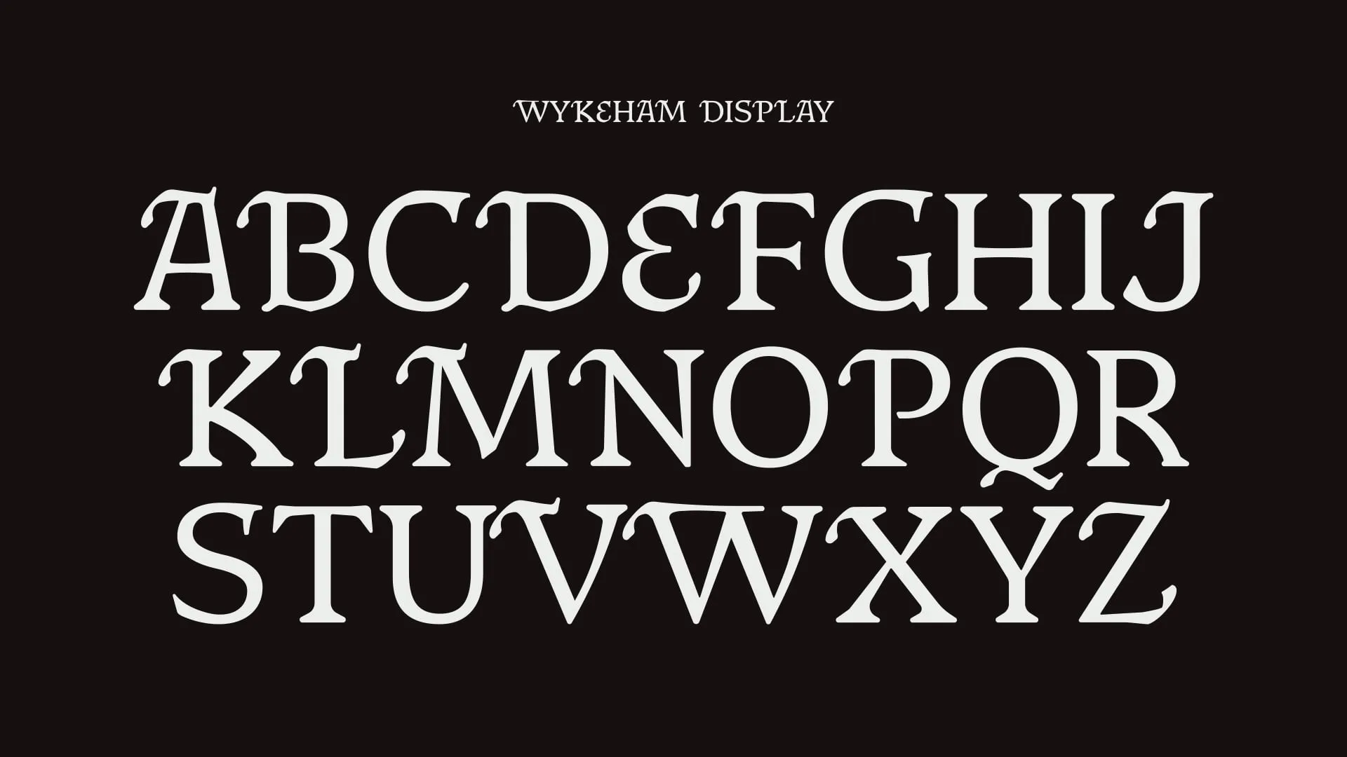
We explored this with Jess Game Knit, where Jess had an existing handwritten style that she'd been using on her market stall materials. Rather than trying to find a typeface that vaguely resembled her handwriting, we digitised it and developed it into a functional font, introducing alternative characters and ligatures to help preserve some of the natural variation you get when somebody writes by hand.
What I particularly like about this is that it takes something genuinely personal to the business and makes it usable across an entire brand. Instead of recreating handwritten lettering as an image every time Jess needs a new graphic, she can type using her own handwriting. It can appear on the website, in marketing materials and across other applications while retaining that familiar character. There's a digital benefit too. When used as real text on a properly built website, rather than turning every heading into a flattened image, the content remains available to screen readers and other assistive technologies. It gives us the visual personality without unnecessarily sacrificing the usefulness of actual text.
That's what excites me about bespoke typography. It doesn't always have to be a grand exercise in creating an entirely new visual language. Sometimes it's about recognising something distinctive that already belongs to the organisation, then developing the tools to make better use of it.

Bespoke Doesn't Have To Mean Impractical
One concern I can understand from businesses considering a custom typeface is whether it creates more problems than it solves. After all, there's little value in commissioning something beautiful if nobody can actually use it.
Fortunately, creating a functioning font means it can be integrated into everyday design and development workflows much like a commercially available typeface. We produce formats such as OTF for compatible desktop applications and WOFF or WOFF2 for use on websites, allowing the same typography to be implemented across print and digital environments. There are still practical considerations around installation, font licensing, character support, browser performance and applications that restrict custom fonts, but those are things we can plan around rather than reasons to dismiss the idea.
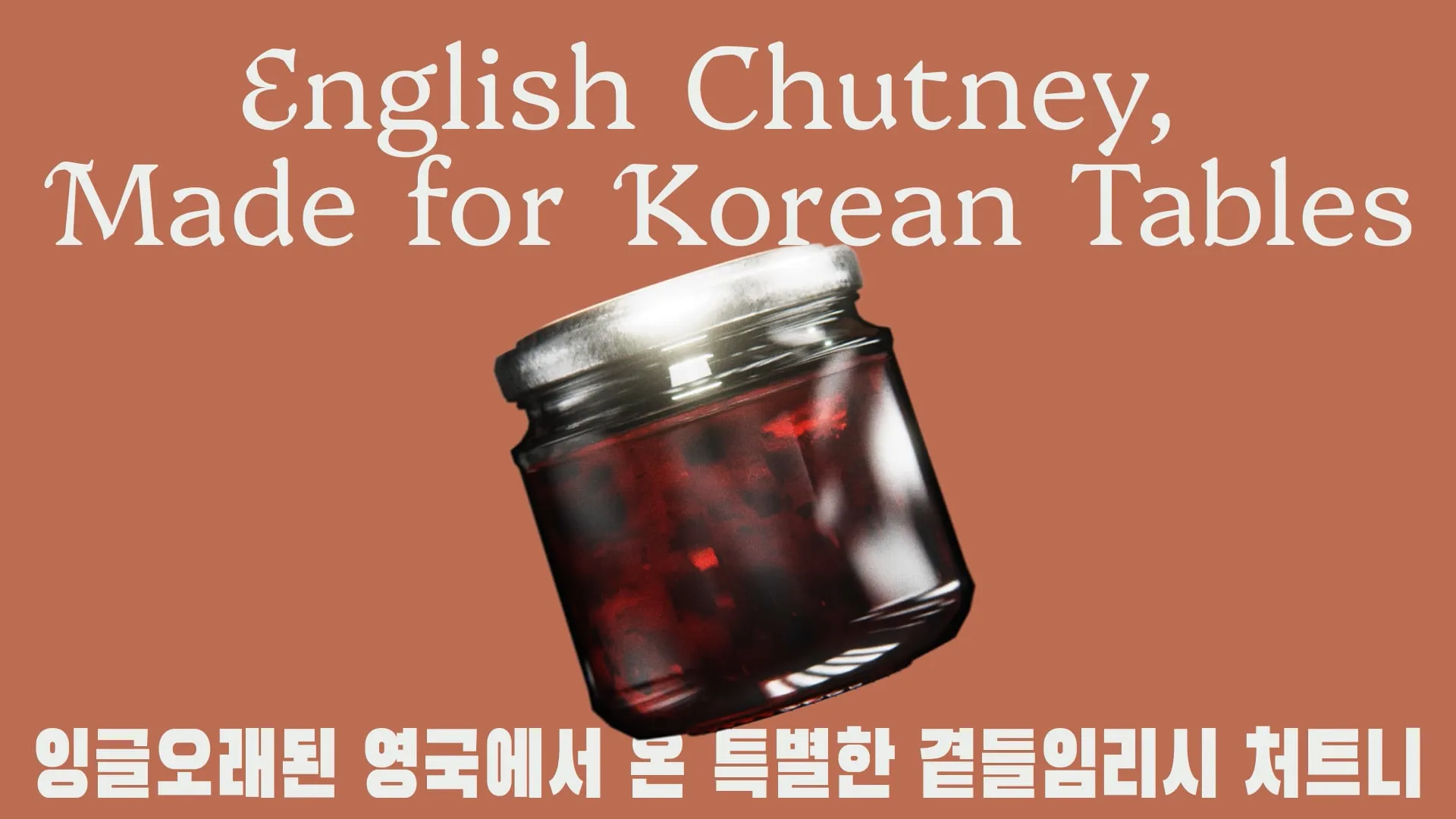
The bigger consideration is how the typography will actually be used. A beautiful display face might be perfect for headlines but entirely unsuitable for large passages of copy. A handwritten typeface may bring enormous personality to a brand but still need a more conventional supporting family for practical information. Not every project needs multiple weights, italics and an enormous character set. Sometimes a distinctive display face, a carefully modified family or even a small collection of bespoke letterforms provides everything the identity needs.
We also need to be clear about what ownership means. A genuinely bespoke typeface created exclusively for a client can offer a level of distinction and control that simply isn't available from an existing font, provided the rights and licensing are agreed properly. A modified open-source typeface can give a brand additional character, but the underlying design remains subject to its original licence and isn't exclusive in quite the same way. Both approaches can be valuable. They simply offer different things.
Is Custom Typography Worth The Investment?
I certainly wouldn't recommend custom typography for every branding project. Sometimes an existing typeface is absolutely the right answer, and attempting to improve it would achieve very little beyond adding time and cost. There are exceptional fonts available, and part of being a good designer is recognising when the right thing already exists.
But for organisations looking to establish a stronger visual identity, particularly those working across lots of different formats or with relatively few distinctive brand assets, I think typography deserves serious consideration. It's something your audience encounters constantly, it's closely connected to the way you communicate and it can introduce a level of personality that extends much further than an individual logo or graphic device.
There's also something particularly appealing about investing in craft. When an organisation takes the time to create something specifically for its identity, whether that's a subtle adjustment to an existing typeface or a complete bespoke family, that consideration can become part of how the brand expresses itself. It demonstrates care in something most people take for granted, and when that care is carried consistently throughout the wider identity, the result can be rather special.
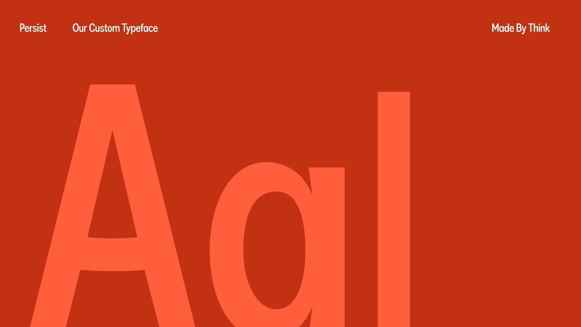
At Think, we've been exploring custom typography at different scales, from carefully modified open-source fonts through to digitised handwriting and fully bespoke type design. It's an area we're genuinely excited about because it brings together so many things we enjoy: brand strategy, visual identity, technical design and a slightly obsessive attention to detail.
If you're considering a rebrand, refreshing an existing identity or simply trying to make your organisation feel more distinctive, we'd be happy to explore what typography could bring to it. That might mean developing something entirely your own, modifying an existing family or finding a brilliant typeface that already does exactly what you need.
For me, the exciting part isn't simply making a new font. It's finding another way to give a brand its own voice, and making sure that voice comes through in everything it has to say.