When we started rebranding Think, typography was probably the first thing I knew I wanted to change. I wasn't looking for a subtle evolution or a slightly nicer version of what we already had. I wanted the new identity to create a significant feeling of change and, more importantly, I wanted the creative side of the business to come through much more strongly. Think had been around for nearly 25 years, but we were moving into a new phase and I wanted the brand to feel considered, distinctive and properly made by us rather than assembled from a collection of perfectly good ingredients that could just as easily belong to another agency.
We looked at a lot of typefaces. There are thousands of brilliant ones available and I am certainly not somebody who thinks every branding project needs to reinvent the alphabet, but I had a fairly specific idea of what I wanted Think to feel like and nothing we tried quite landed. Some were too clean, some felt too fashionable, some didn't have enough character and others worked beautifully in one application but fell apart as soon as we started imagining them across everything else we needed the identity to do.
Our purpose is Creativity with Purpose, and there was a genuine purpose behind pushing the typography further. If we were asking clients to trust us with their identities, challenge conventions and create things that felt individual to them, I thought there was something quite powerful about applying that same mentality to ourselves. The easiest answer would have been choosing a good commercial typeface and moving on. The more interesting answer was seeing whether I could create the thing I had in my head. That became Persist.
Born From Print, Built For Digital
I've always had a soft spot for condensed grotesque typefaces. They can carry an enormous amount of personality inside a surprisingly restricted space, and I love that tension between something that feels practical and utilitarian while still being expressive. There is also something about the slightly exaggerated proportions of a condensed letterform that gives you opportunities you simply don't get in a more conventionally proportioned typeface.
That felt particularly appropriate for Think because our history sits across two different worlds. The business grew up in advertising, print and production, with all the methodical thinking that comes with press sheets, artwork, grids and Pantone chips, while the agency today increasingly works across websites, interfaces, motion and digital platforms. The vibe I wanted to capture for the typeface was being "born from print but built for digital", and that became a really useful way of articulating what I was trying to achieve.
I looked back towards older grotesques such as Akzidenz-Grotesk and the typography you find in railway signage, editorial design, advertising and posters. I wasn't interested in creating something deliberately retro, though. The historical reference was important because it connected naturally to Think's production heritage, but the challenge was taking some of that character and making it useful for the way we communicate now.
Condensed typography happens to work incredibly well in digital environments too. You can create a headline with real scale and impact without requiring it to occupy the entire screen on a phone, while the narrower proportions leave plenty of opportunity to introduce quirks and personality into individual characters. That balance between expression and practicality felt very much like us.
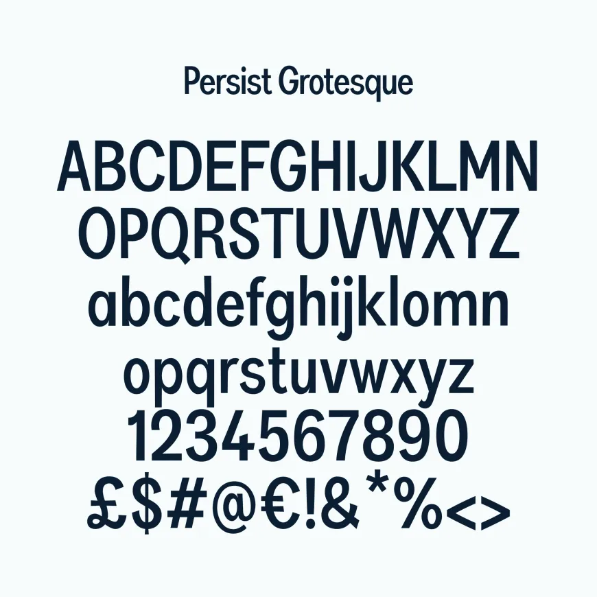
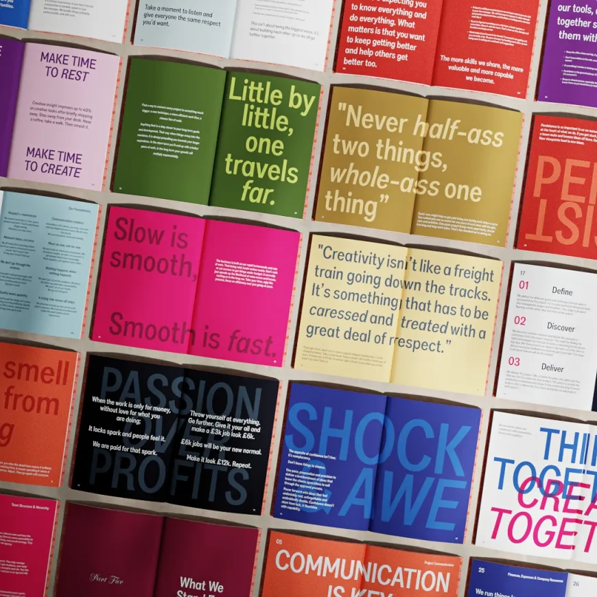
Making Something That Was Actually Ours
Once I started drawing it, it became considerably more than creating a handful of nice-looking letters for the Think logo. If we were going to call it our typeface, I wanted it to behave like one.
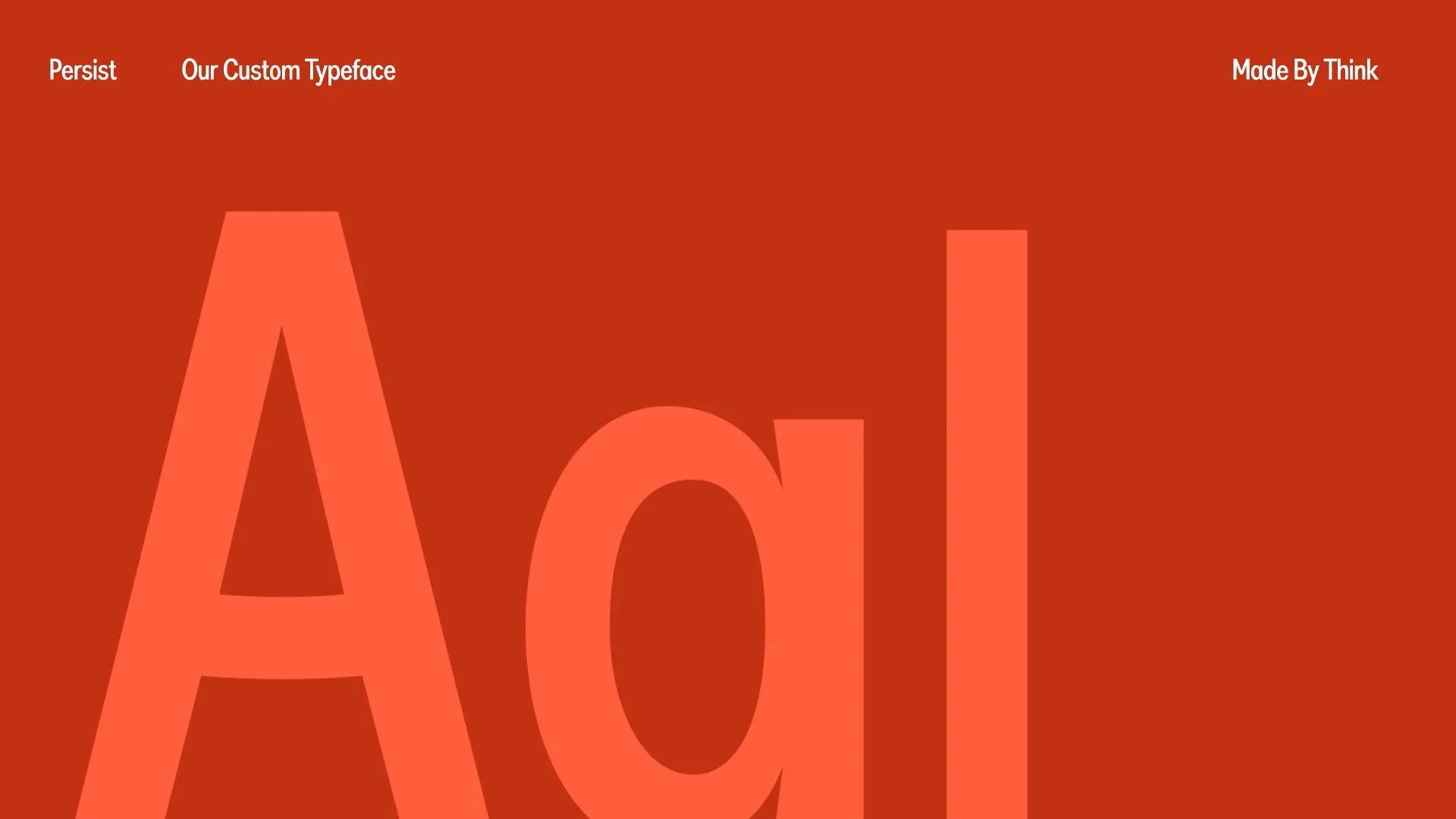
Every character was drawn and refined specifically for Persist rather than taking an existing font file and modifying it. The proportions, widths and optical relationships went through multiple rounds of adjustment, gradually building out the alphabet, numbers, punctuation, currencies and the slightly less glamorous characters you suddenly realise you need when you try to use a font in the real world. Persist Specimen
It became one of those slightly obsessive creative projects where you can lose an evening moving part of a lowercase letter by a few pixels and somehow convince yourself that this is a completely reasonable thing for an adult to be doing. But that obsessive bit is also what I enjoyed. It gave me an opportunity to really dig into typography rather than simply selecting it, and it pushed my own understanding of how tiny changes in spacing, width, tapering and proportion affect how a word feels.
The specimen became an important part of that process because I wanted to stress-test it rather than just show it in carefully selected words where I already knew it looked good. We tested numbers, accents, currencies, unusual combinations, webfont implementation and all sorts of deliberately awkward content to see where the weak points were. Persist Specimen If a custom typeface was going to become part of Think's identity, it had to survive contact with an actual business.

Then It Just Worked
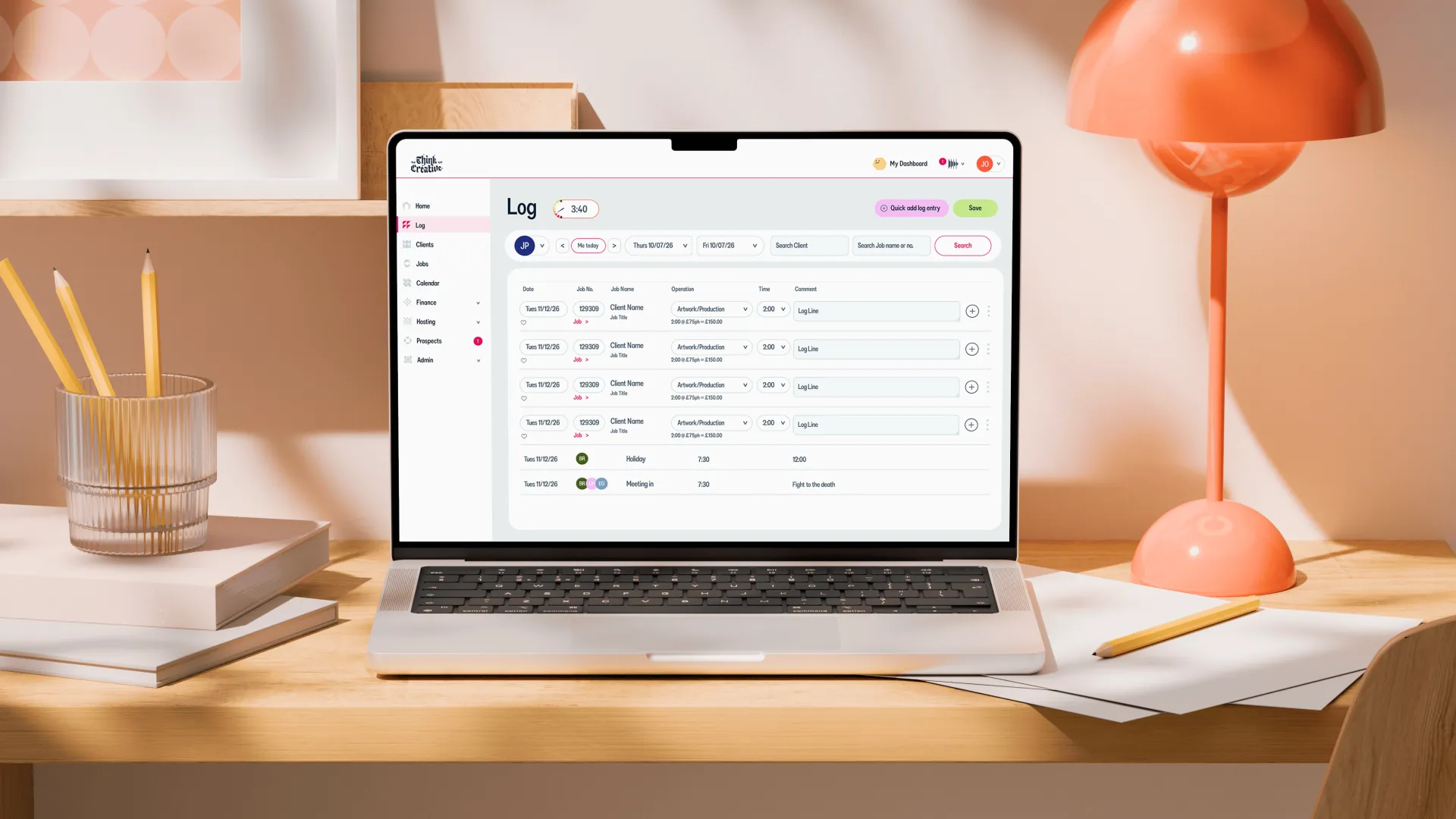
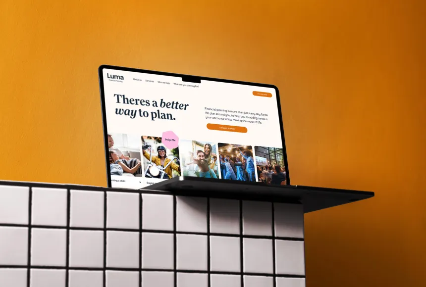
Probably the most satisfying part is how naturally Persist has settled into everything else we've made since. It appears on the website, proposals, presentations, business cards, internal platforms, our Brand Book, our Playbook and plenty of the smaller bits and pieces that make up the day-to-day identity of Think. It doesn't feel like a special asset that needs an occasion. It just feels like our typeface.
That's important because typography carries far more of a brand than I think people sometimes realise. A logo might appear once on a page, while the typography has to carry the headline, the explanation, the navigation, the call to action and almost every other piece of communication around it. Persist can be huge and expressive when we want it to be, then quieten down and sit comfortably inside an interface or presentation without suddenly losing its character.
What surprised me most was that it simply worked. There wasn't a moment where we finished the font and then struggled to work out what to do with it. As the wider Think identity developed, Persist kept finding its place within it, and the tone of voice we were developing started to feel particularly natural when written in it. The words and the typography seemed to have the same confidence and rhythm, which is exactly what I wanted from the beginning.How the typeface looks in digital applications