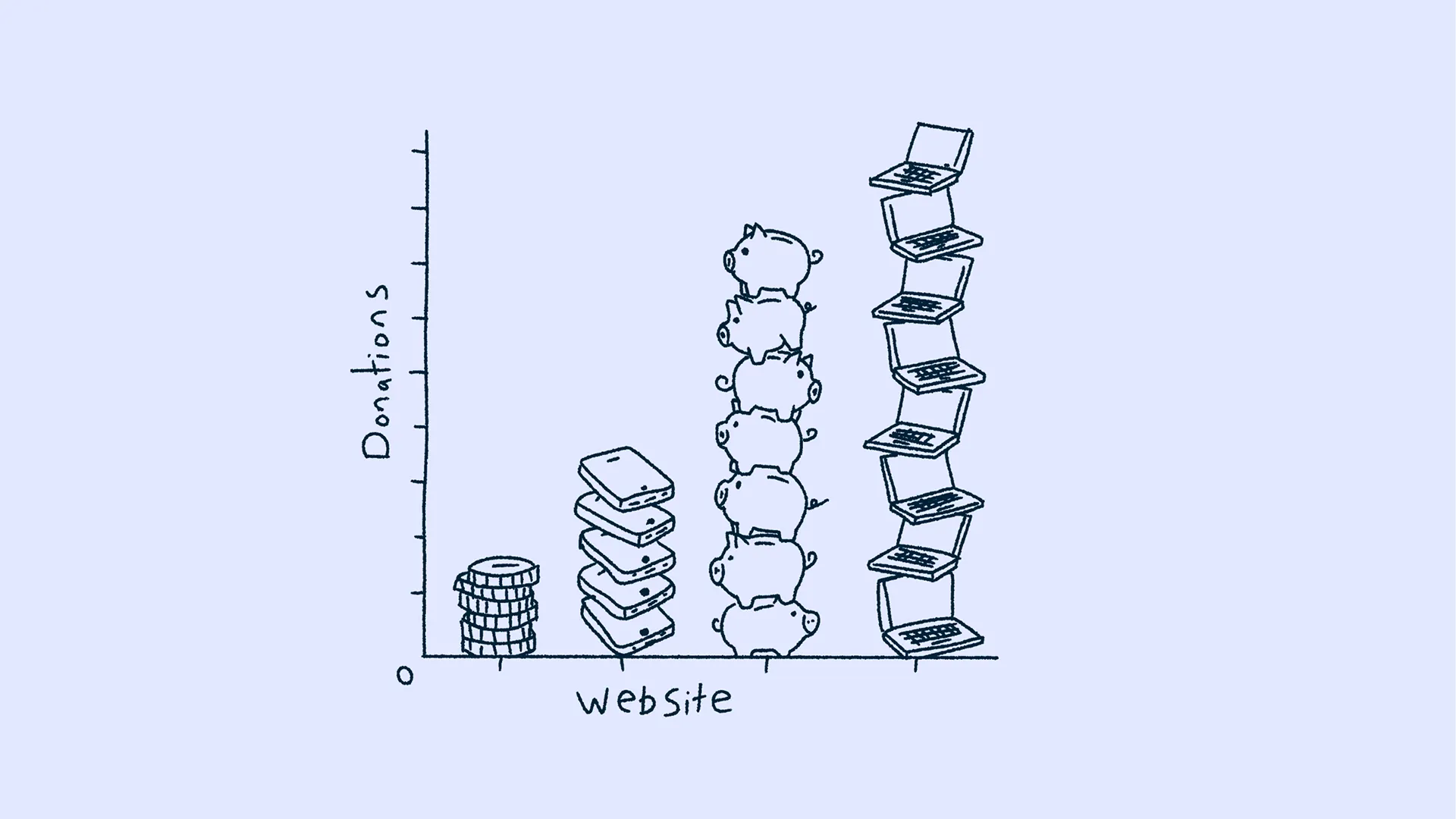
Sometimes, even as an agency that designs and builds websites, we have to be honest and admit that a new website isn't always the answer. That's particularly important when we're talking to charities, where budgets are under pressure, fundraising can be difficult and a significant digital investment needs to do considerably more than simply make everything look newer. A redesign can absolutely make a difference, particularly where an existing website is outdated, difficult to use or no longer reflects the organisation properly, but it can also represent a substantial amount of money without necessarily solving the problem you started with.
So before we start talking about new navigation, visual identities or what the homepage could look like, I think there is a much simpler question worth asking. Are people struggling to support you because the experience is getting in their way, or are you simply not reaching enough people who have a reason to support you in the first place? Those are very different problems, and while a website can play an important role in both, it can't solve them in exactly the same way.
The Problem Might Not Be The Website
There's a slightly counterintuitive thing we've found when working with charities, which is that the strongest fundraising experience isn't necessarily the one that starts by asking for money. Of course, the donation route should always be visible and easy to access, but if every part of the experience is immediately pushing somebody towards a donation before they've had a chance to understand the organisation, the people it helps or why the work matters, you can end up asking for support before you've earned the emotional connection behind it.
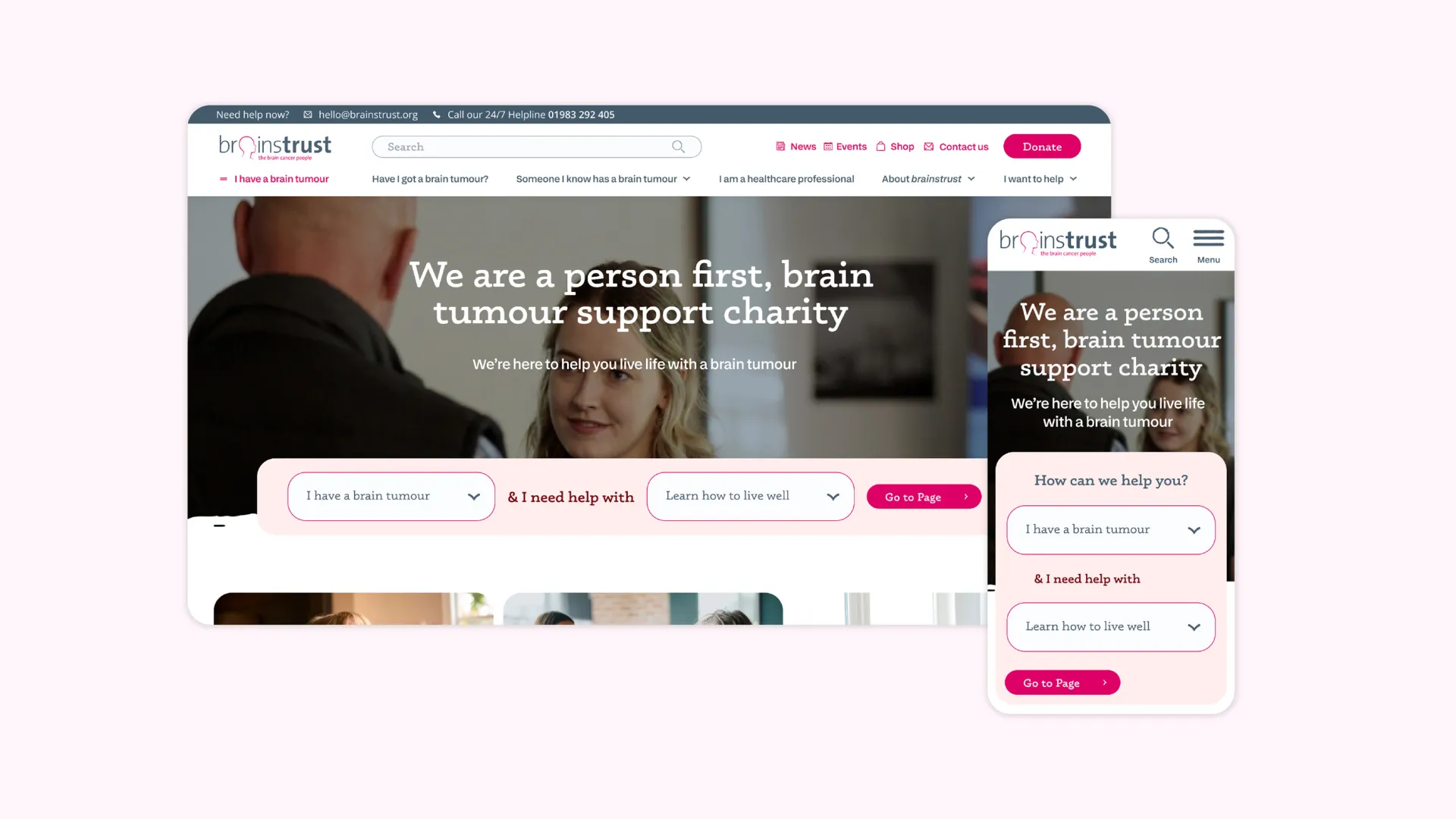
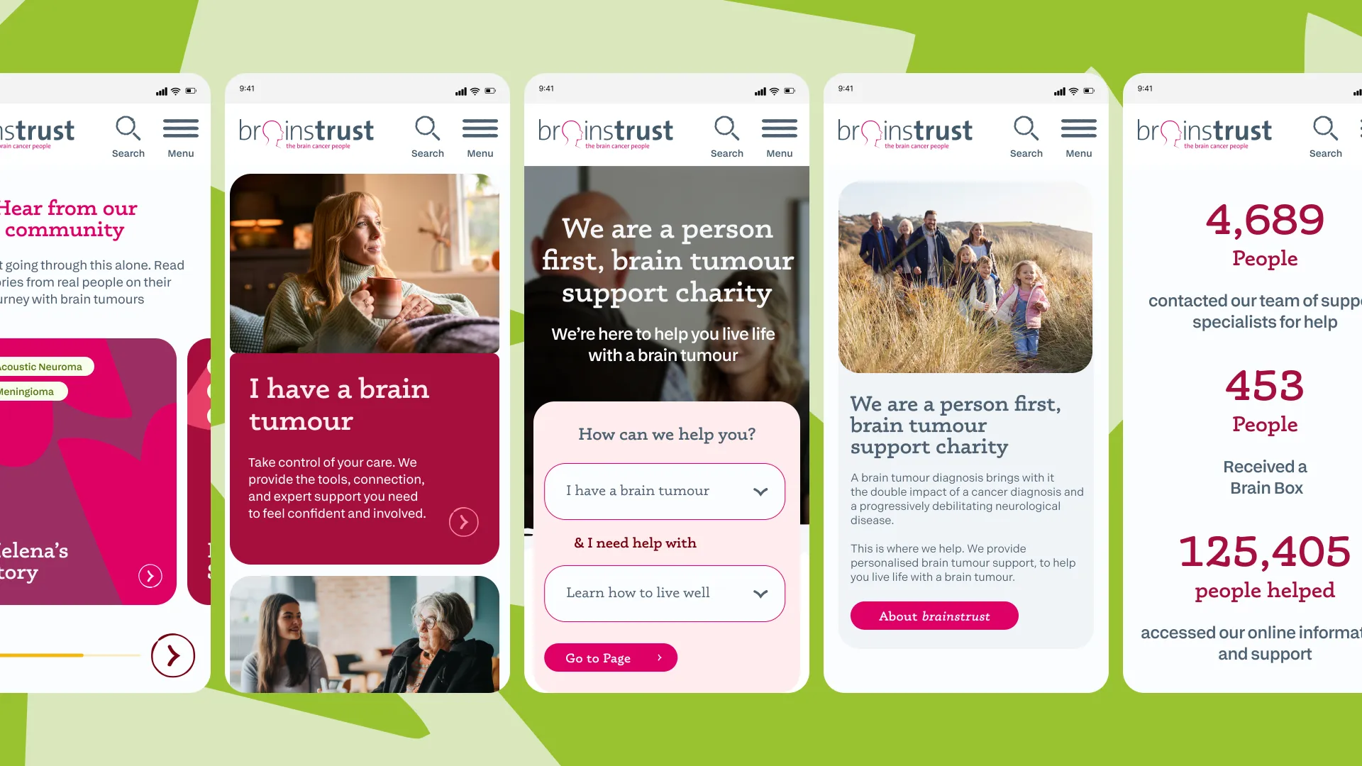
I saw this very clearly when working with brainstrust. When we started looking through the existing website analytics, the behaviour wasn't necessarily what you might expect if you approached the project primarily as a fundraising exercise. Far more people were engaging with the charity's services, support content and stories than they were spending time exploring traditional "About Us" information. When we spoke to the leadership team, that made complete sense. A significant amount of support came from people who had experienced the charity personally, whether they'd received help themselves, had a family member who had been supported or had developed a connection with the organisation through what it actually did.
That changed the emphasis of the conversation. Rather than making the website shout more loudly about needing donations, the more important job was helping the charity help people. The site needed to make resources easier to discover, explain the support available, tell genuine stories and build a much clearer understanding of what brainstrust actually does. Fundraising still had an important place across the website, and the donation route needed to remain readily available wherever somebody reached the point that they wanted to contribute, but it didn't need to dominate every page or make the whole experience feel like a sales journey.
I think that's an important distinction. The most persuasive demonstration of a charity's value is often the work itself. If the website can help somebody at a difficult point in their life, introduce them to the right support or make a complicated subject feel more manageable, you're communicating the organisation's purpose far more powerfully than simply telling visitors that their donations matter.
Help People First
That mentality applies beyond a conventional charity website as well. Sometimes improving the organisation's digital offer doesn't mean replacing the main website at all, and there can be considerably more value in investing in one part of the experience that solves a very specific problem.
Brain Tumour Hub is a good example of that. Rather than being simply another page within the wider brainstrust website, it was developed as a dedicated resource that helps people affected by brain tumours find organisations and support relevant to their circumstances. There is a substantial amount of information involved, so the challenge wasn't just making it look better. It was working out how people could search for it, understand their options and reach the right resource without needing to understand the structure of the charity or the terminology behind every service.
That kind of investment can add genuine value to a charity's digital offering before, or sometimes instead of, committing to a complete rebuild. Depending on the organisation, that might be a resource hub, an application, a fundraising tool, a members' area, a volunteer portal or a more useful way for people to search and access support. The right answer depends entirely on what users need and where the existing experience is falling short.
For brainstrust, the main website itself was also more than 12 years old, so there were perfectly good reasons to rethink the wider platform. But if your website was rebuilt three years ago and is fundamentally sound, replacing it because donations aren't where you'd like them to be probably wouldn't be my first recommendation. I'd much rather understand what people are doing, where they're getting stuck and whether there is a more focused improvement that could make a difference.
Spend Money Where It Makes A Difference
That could start with something as simple as a UX audit. Look at how people are using the site, which pages they're reaching, where they're leaving and what happens when they try to complete the actions that matter. If the content management system gives you enough flexibility, improving the donation journey, restructuring key pages or introducing clearer routes through the content might achieve far more than rebuilding the entire thing.
The donation experience itself deserves particular attention because small pieces of friction can become significant once somebody has decided they want to support you. The journey needs to work properly on mobile, the form should be straightforward and the number of steps should be sensible. If your payment provider allows people to use options such as Apple Pay or Google Pay through services like Stripe, that can make giving considerably quicker than asking someone to find their card, type everything in manually and work through a lengthy checkout process. The important thing is reducing unnecessary resistance at the moment somebody is ready to act.
The way the donation is framed can matter too. Rather than simply presenting a blank field and asking somebody how much they'd like to give, charities often have an opportunity to explain what different levels of support could help make possible, provided those statements are accurate and genuinely reflect how the organisation uses its funding. A suggested donation becomes much more meaningful when somebody can connect the number with the work behind it, and it reinforces the wider point that fundraising is strongest when people understand what they're helping to achieve.
None of those things automatically requires a completely new website. Sometimes they require better content, better UX, a more suitable payment journey or some relatively focused development work. The important thing is diagnosing the actual problem before deciding what the solution should look like.
Design Still Has An Important Job
I'm still a creative at heart, so none of this is me suggesting that branding or design somehow sits underneath the fundraising conversation. I think the opposite is true. A strong brand can help people understand the organisation, trust what they're seeing and build an emotional connection with the work, but that brand needs to be expressed through the whole experience rather than simply through a more polished logo or a prettier homepage.
For charities in particular, credibility comes through clarity, empathy and consistency. The way stories are told, how resources are structured, whether somebody can find help quickly and how comfortably they can move from understanding the organisation to supporting it all contribute to the brand. The visual identity, photography, illustration, typography and language have a role in making that experience distinctive and human, but they need to support what somebody is trying to achieve rather than become the thing they're being asked to admire.
In my view, the most successful charity websites don't put fundraising front and centre at the expense of everything else. They show people who the organisation helps, how it helps them and why that work matters, while giving supporters a clear and frictionless opportunity to contribute when they're ready. Sometimes delivering that properly means rebuilding the website, particularly where the existing platform has reached the end of its useful life. Other times it might mean improving one journey, creating a new digital resource or simply making much better use of what you already have.
That's the conversation I'd rather have at the beginning of a charity project. Not "How quickly can we get you a new website?" but "What do you need your digital presence to do better, and where will the investment make the greatest difference?" Because ultimately, the strongest reason to support a charity isn't that it has a brilliant website. It's that people understand the difference the charity makes, and the website helps them experience that difference for themselves.