We live and breathe websites, which means we are constantly seeing things we want to try, improve or completely rethink. If I'm honest, I have to stop myself from redesigning our own website every couple of months because something new has appeared, somebody has built an interaction I like or we've learnt something from another project that suddenly makes me look at one of our own pages differently. The reality is that a good website is rarely something you finish, launch and never think about again. People use it, technology changes, your business evolves and, if you're paying attention, there will nearly always be something you can make slightly better.
That doesn't mean constantly rebuilding everything. Quite often the improvements that make the biggest difference are relatively small, whether that's changing the wording of a call to action, reorganising a page so the important information appears sooner, improving a mobile menu or realising that a case study doesn't actually tell somebody enough to understand what you did. We regularly look at analytics, user journeys and the way people interact with our own sites for exactly that reason, and we apply the same thinking when we're designing and reviewing work for clients. There are hundreds of things we could talk about, but these are 7 of the principles we come back to on almost every website we work on.
1. Work Out What People Are Actually Trying To Do
Before worrying about animation, page layouts or what the hero section looks like, we want to understand why somebody has arrived in the first place. Are they trying to work out what you do, compare your services, find a particular piece of information, buy something, make an enquiry or complete an application? It sounds obvious, but websites have a habit of becoming organised around what an organisation wants to tell people rather than what those people have actually come looking for.
Once you understand those core journeys, a lot of the design decisions become easier. If generating enquiries is important, for example, people should be able to understand what you offer and how to speak to you without going on a treasure hunt through half the website. If somebody is coming for support, that route needs to be obvious. If you're selling products, the information somebody needs to make a decision shouldn't be hidden several clicks away.
That doesn't mean putting an enormous "CONTACT US" button in the middle of every page. It means understanding what success looks like for that particular visitor and making sure the structure, content and calls to action are helping them get there.
2. Stop Trying To Reinvent The Wheel
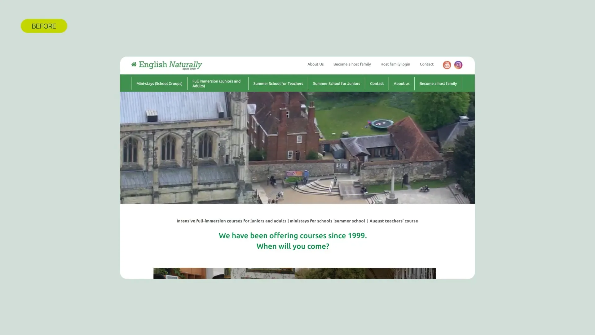
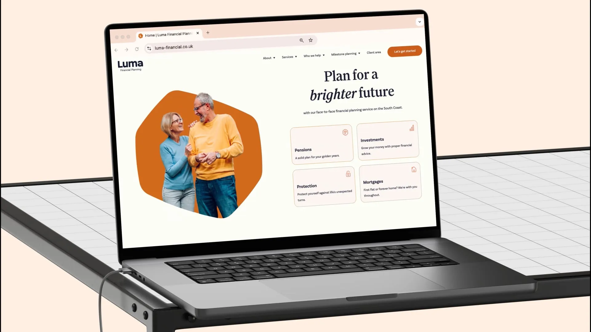
We completely understand the temptation to make a website behave differently from everybody else's. We want brands to stand apart too, and if you're investing properly in your website then it absolutely shouldn't feel like somebody has taken your competitor's site, changed the logo and called it a day. But there are some conventions that exist because people already understand them, and making somebody relearn how a website works isn't always the best way to demonstrate creativity.
Navigation is probably the clearest example. If somebody wants to understand your services, calling the section something incredibly abstract might sound interesting internally, but it can also make the site more difficult to navigate and less obvious to search engines. You can still bring enormous personality into the language, layout, visual identity and interactions without making somebody guess where you've hidden the basic information.
The same applies to calls to action. "Find out more" repeated 10 times across a website isn't particularly helpful or interesting, but replacing it with something specific such as "Explore our website services", "See how we approached the project" or "Meet the team behind the work" gives people a much clearer idea of where they're going next while allowing the brand voice to come through. For us, the interesting creative challenge isn't making familiar things confusing. It's taking the things people already understand and making them feel unmistakably yours.
3. Make The Content Easy To Get Through
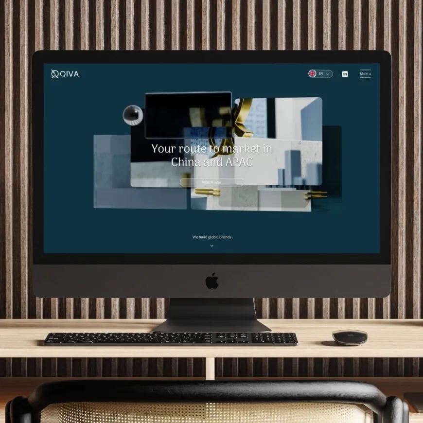
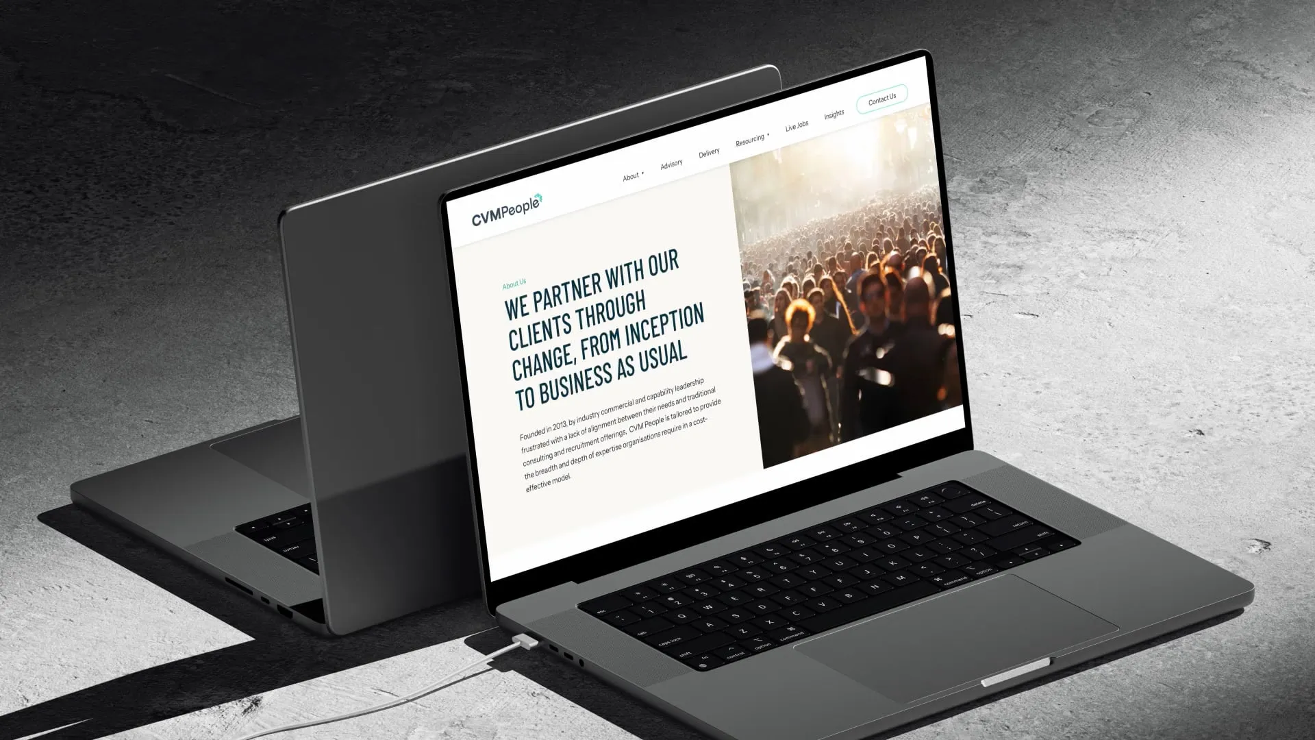
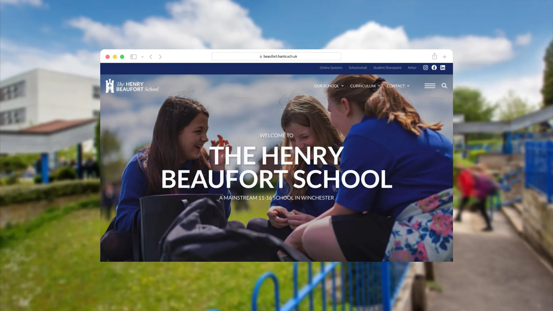
People don't usually arrive on a website, settle into a comfortable chair and read every word from top to bottom. They'll scan, pick out the things that catch their attention, jump between sections and decide fairly quickly whether there is enough there to keep exploring, so good hierarchy is doing a huge amount of work before anybody has consciously thought about the typography.
We like having a clear range of heading sizes and using them consistently so somebody can understand the shape of a page almost immediately. The headline establishes the main idea, subheadings break the content into useful sections and supporting copy can then provide the detail for the people who want it. Images, captions, pull-outs and statistics can all help create rhythm and give longer pages room to breathe, provided they are actually helping tell the story rather than being added because the page looked a little empty.
The balancing act is being concise without becoming generic. Cutting everything down to three vague sentences isn't necessarily good UX if you've removed the information somebody actually needs, and equally there is little value in writing 2,000 words when 600 would communicate the point properly. We want enough personality and detail to make the content useful, but structured in a way that lets somebody choose how deeply they want to engage.
4. Treat Mobile As A Real Experience, Not The Small Version Of Desktop
"Mobile first" has been part of the web design conversation for years, so it can almost sound like something that doesn't need saying anymore, but it is still very important. In September 2026, mobile devices accounted for around 53.6% of UK web traffic compared with roughly 41.8% on desktop, according to StatCounter, and Google now crawls and indexes sites using its smartphone crawler as standard.
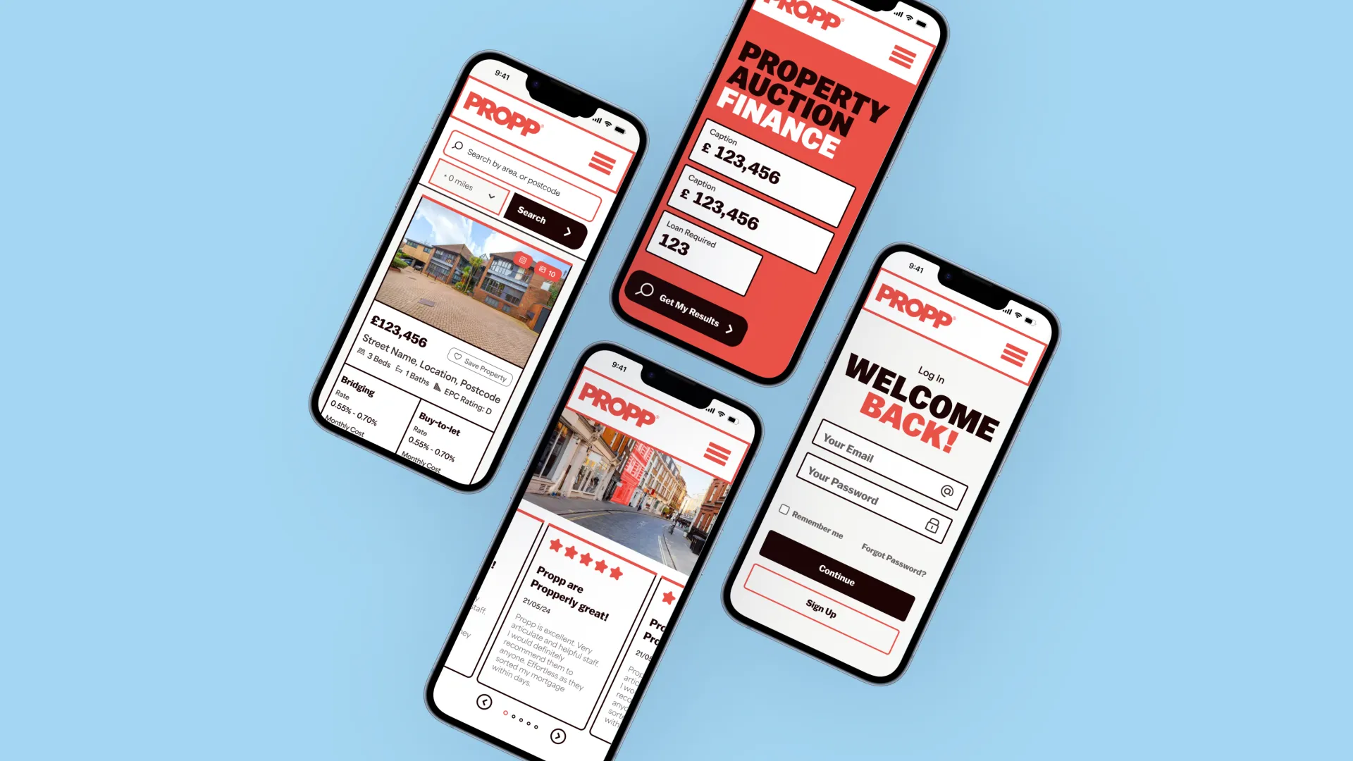
The important part for us isn't simply squeezing the desktop design down until it technically fits on a phone. The core journey needs to work brilliantly on that smaller screen, particularly the navigation, contact routes, forms, purchasing journeys and anything else that's central to what the website is supposed to achieve.
Sometimes that means changing the design rather than compromising it. A large navigation interaction that works beautifully with a mouse might need a completely different solution on mobile. A complicated desktop comparison could become something much more focused. Content might need reorganising so the most important information arrives sooner, and buttons need enough space around them to actually work with somebody's thumb. If the mobile experience isn't working, we don't think the answer is to accept that it will always be slightly worse. Change the experience until it works properly.

5. Make Forms Feel Less Like Homework
Forms are one of those things that don't feel particularly exciting until you're staring at one asking you to complete 47 fields before you're allowed to press submit. At that point, the quality of the form suddenly becomes one of the most important things about the website.
Our first question is always whether everything being requested is genuinely necessary. Every additional field is another piece of information somebody needs to find, understand and enter, so if you're asking for something simply because it might be useful one day, it is worth challenging whether it belongs there.
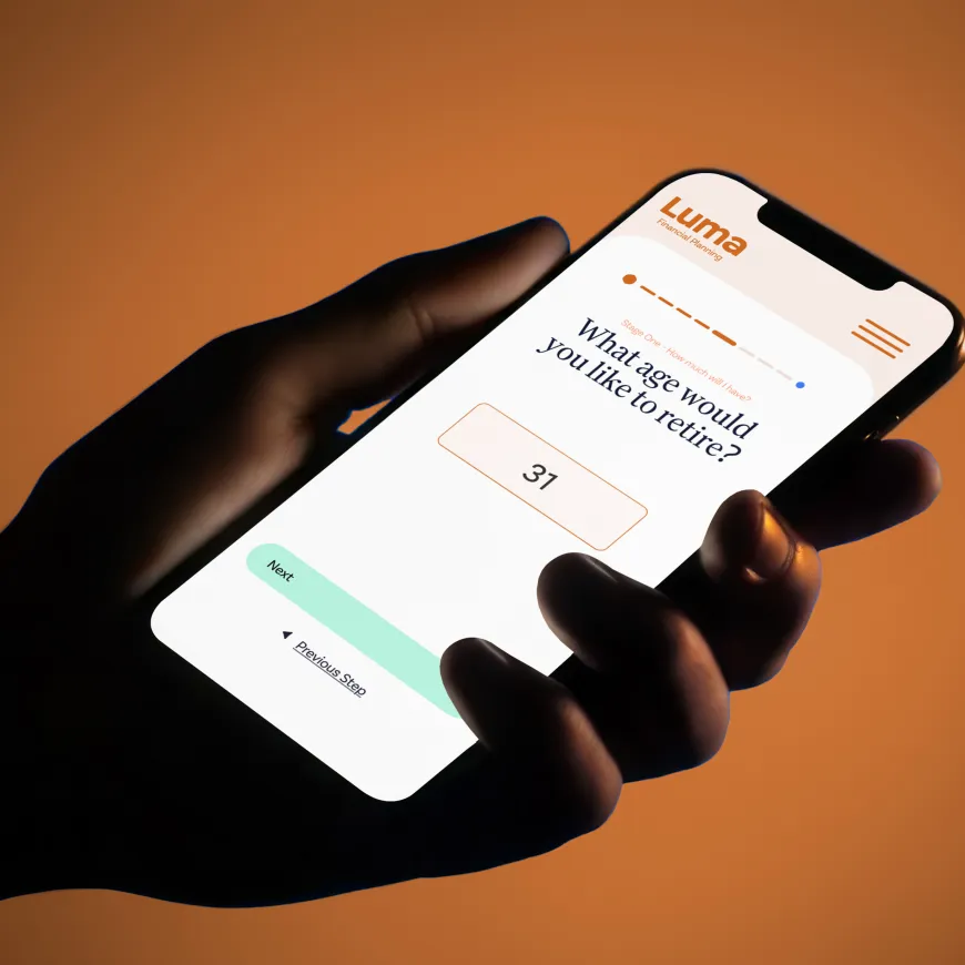
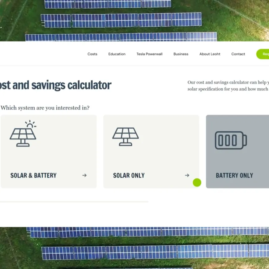
Sometimes a long form is unavoidable. An application, detailed quotation request or technical specification may genuinely require a lot of information, and in those situations we would rather make the process feel manageable than pretend the complexity doesn't exist. Breaking the journey into logical stages such as personal details, company information, project requirements and review can make a large amount of information feel considerably less intimidating than presenting somebody with one enormous wall of boxes.
Clear labels, sensible validation and useful error messages matter too. If somebody has missed something, tell them exactly what needs fixing rather than simply throwing them back to the top of the page. Once they submit, confirm that everything has worked and explain what happens next. They have just made the effort to contact you, so the experience shouldn't become less thoughtful at the point you finally have their attention.
6. Don't Let The Creative Work Kill The Performance
As a designer, I love putting interesting things on websites. Video, animation, large photography, interactive elements and expressive typography can completely transform how a brand feels online, and we're certainly not going to advocate stripping everything back until every website looks like a government form in the pursuit of a perfect performance score.
That means optimising imagery so it is large enough to look sharp without downloading several unnecessary megabytes, making sensible choices about video delivery, being thoughtful about third-party scripts and only loading assets when they are actually needed. Below-the-fold imagery and media can often be lazy-loaded so the browser isn't trying to download an entire page before somebody can use it, although critical content needs to be handled properly rather than lazily hiding everything behind interactions. Google makes that distinction in its own mobile and lazy-loading guidance.
Video is another good example. Hosting appropriate content through services designed to deliver it efficiently can make far more sense than asking your own server to throw enormous video files at every visitor. The implementation matters just as much as the idea.
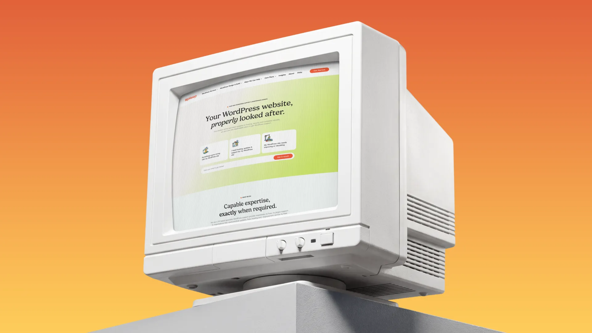
Upkeepstudio.co.uk is a nice example from our own work. In our Lighthouse checks it regularly sits in the mid-to-high 90s on desktop, and that's not because there's nothing happening on the site. It's because we designed and built it with performance in mind, keeping imagery lightweight, controlling what loads and making sure the creative assets weren't fighting against the experience.
7. Give It To Somebody Who Hasn't Been Looking At It For 3 Months
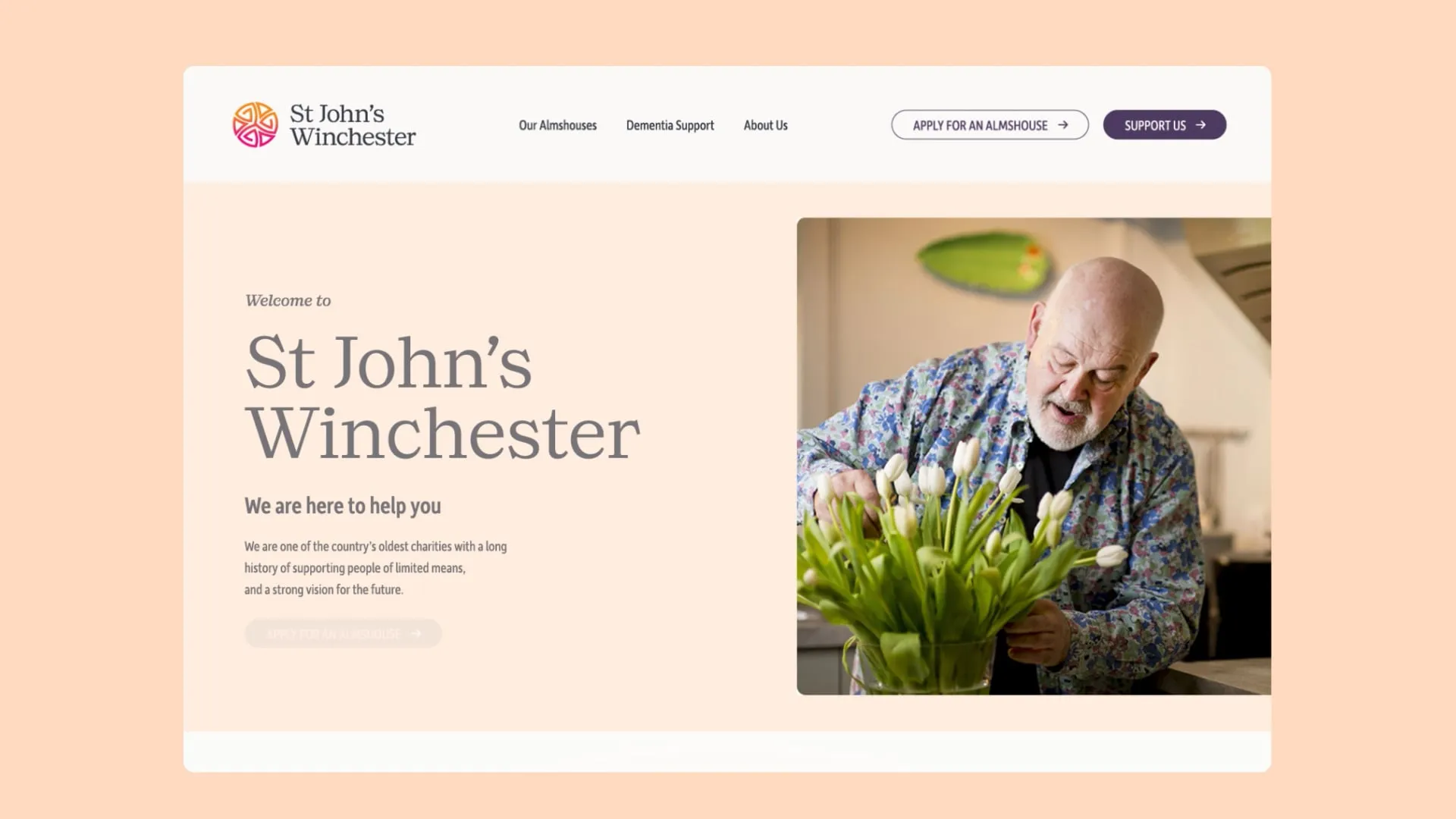
This is probably one of our favourite bits of quality control because it is incredibly easy to become blind to your own work. When you've designed a navigation system, discussed it repeatedly with the client, built it, tested it and clicked through it hundreds of times, of course you know where everything is. You've effectively learnt the website by heart, which makes you one of the least useful people for spotting whether somebody else will immediately understand it.
So we show things to people who haven't been living inside the project. Sometimes that's another member of the team who hasn't worked on the job, sometimes it's a partner, friend or family member, and yes, there have definitely been occasions where somebody's mum has identified a problem that a room full of designers and developers had stopped seeing. When you're incredibly close to all the tiny decisions, it's surprisingly difficult to look at the finished thing in the same way as somebody arriving for the first time.
Give somebody a simple task and don't explain how to do it. Ask them to find a service, make an enquiry, locate a particular resource or understand what the organisation does, then watch what happens. If they hesitate somewhere you thought was obvious, that's useful information. We would much rather discover that before launch than have hundreds of real visitors quietly experience the same frustration afterwards.
Keep Improving What You've Already Got
The useful thing about all 7 of these tips is that none of them automatically means you need a new website. Sometimes a site is fundamentally strong but has gradually picked up a few rough edges, and a UX review, content tidy-up, performance audit or some focused development can make a noticeable difference without throwing everything away and beginning again.
That's partly why we created Upkeep. It gives us a more straightforward way to support, maintain and improve WordPress websites that still have plenty of life in them, whether that's resolving problems, improving performance, updating content or helping the site evolve as the organisation changes. And if the conclusion is that the foundations really aren't doing the job anymore, the same team can help work out what comes next, whether that's a more straightforward new WordPress site through Upkeep or something more bespoke through Think.
The important thing for us is that a website shouldn't stand still simply because it has launched. We look at our own data, question our calls to action, change layouts, add information, remove things that aren't working and occasionally have to stop ourselves from redesigning the entire thing because we've seen a shiny new idea we want to try.
Most of the time, though, making a website better isn't about chasing the latest trick. It's about understanding what people are trying to do, spotting the little bits of friction standing in their way and steadily making the experience easier, clearer and more useful. That's the kind of website improvement we get excited about, even if it means admitting that somebody's mum was right.